Child Psychology Clinic Okotoks
Commercial Decorating
Let us start off by saying we don’t typically take commercial clients. Commercial projects are a completely different beast than residential. Don’t get us wrong, commercial clients are amazing and often give us much more freedom in the design without the emotions of ‘home’ involved, but the thick code book for commercial renovations is not something we are interested in memorizing.
That said, we were hired by Okotoks Child Psychological Services to put together a furnishing plan for their new larger clinic space, which was being built-out by a commercial contractor. Of course, we ended up being a bit more involved in the overall aesthetic of the space and worked with the contractor to achieve a certain look, but thankfully were hands off of the built-out.
Lobby and Reception
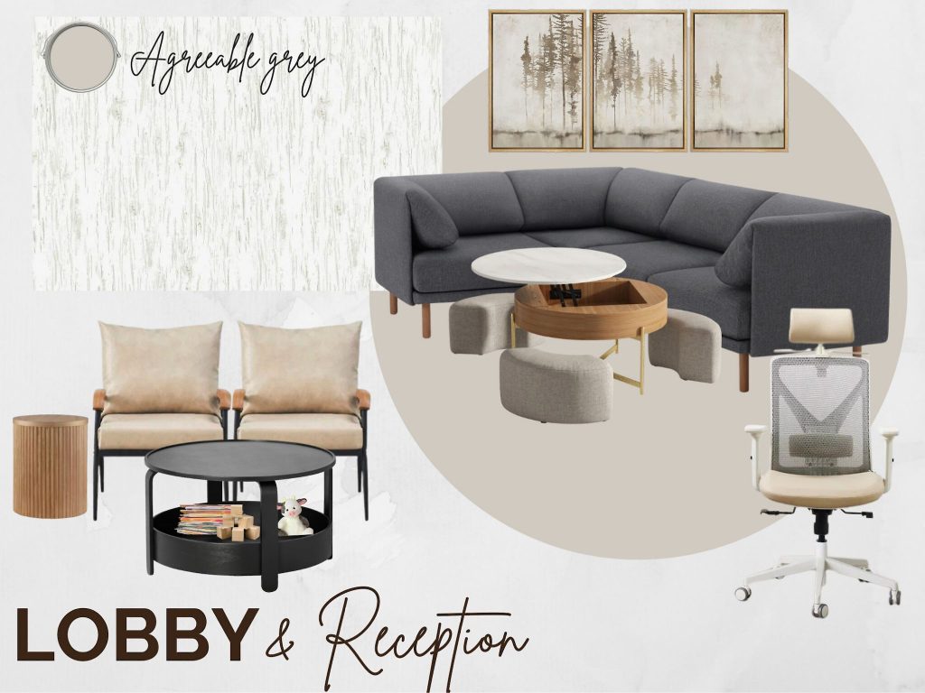
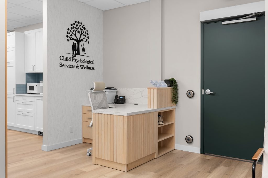
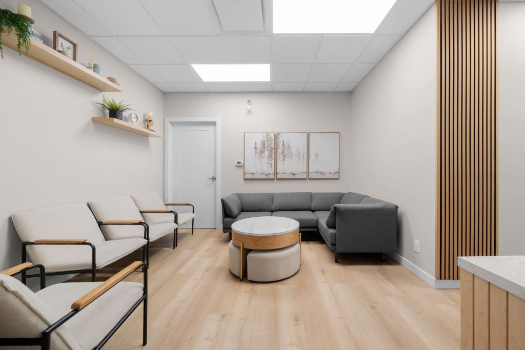
Furnishing a commercial space brings me back to my marketing roots, and understanding how the first impression correlates with your branding for overall client experience. The client’s logo includes a tree with a swing and her request was that the space feel tranquil yet playful.
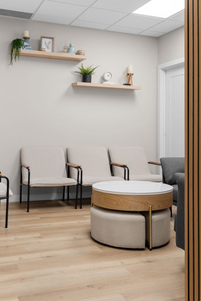
We designed a lobby area that was earthy and calming with soft colours and wood tones to bring in a peacefulness, for what can be a stressful time for families. We expanded upon her ‘tree’ iconography through artwork as well as a ‘birch bark’ wallpaper, and sourced a ‘playful’ coffee table with kid-sizes seat cushions and a surprise lift top full of games.
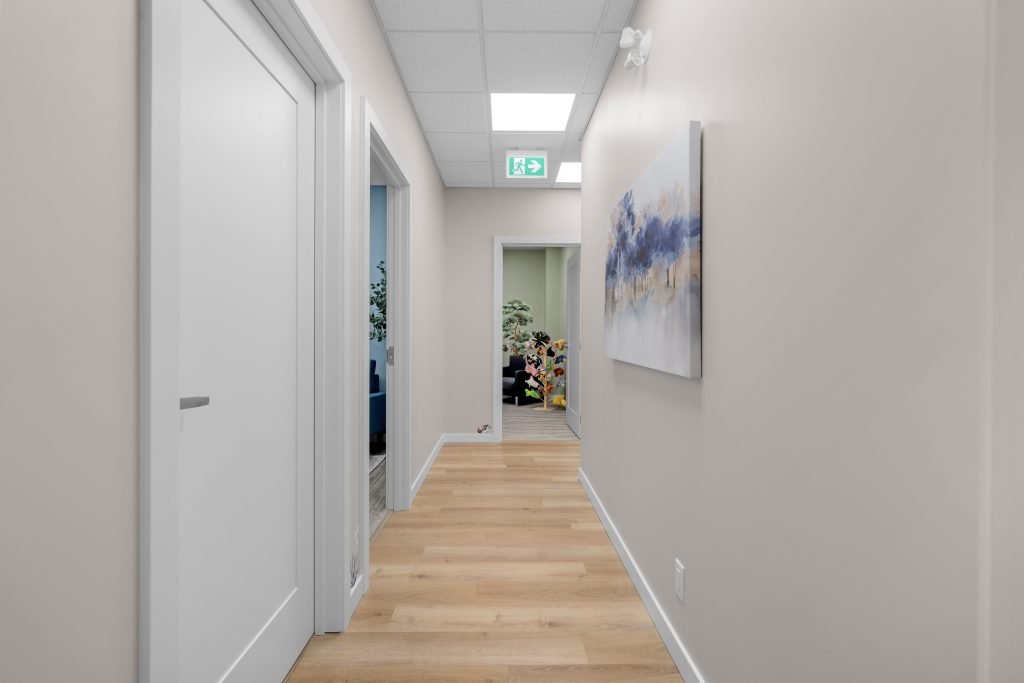
We also chose a light paint colour and LVP flooring for the entire main space that was both bright and warm.
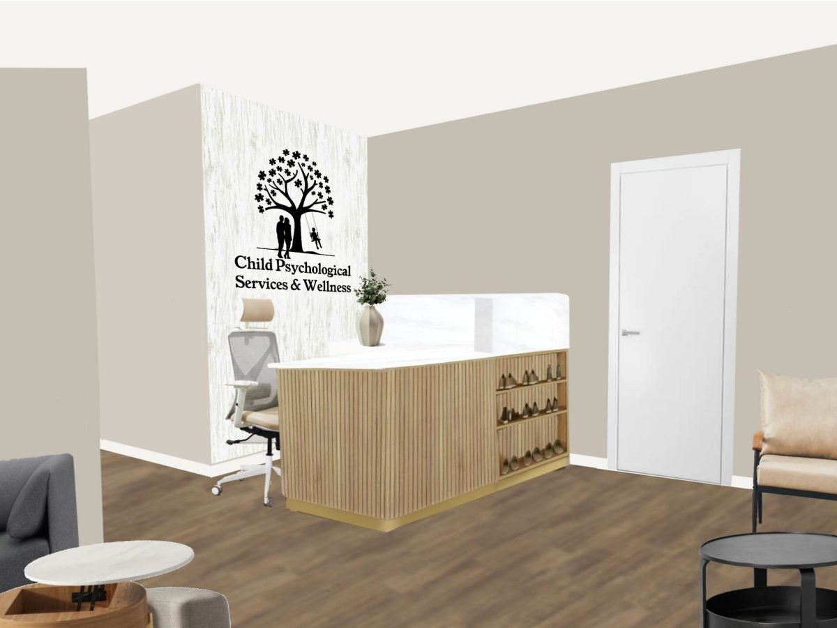

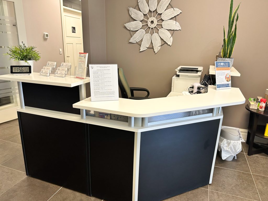
We were also asked to help design a custom desk for the reception area. We wanted to make sure that it was small enough to meet wheelchair access codes (which we consulted with a commercial design expert on), and maintain functionality for a busy clinic. We designed an L-shape desk with built in shoe storage and wood fluting to tie in the birch wallpaper and other wood elements. We spec’d a light white and grey stone countertop, which also acted as a ‘backsplash’ to elevate the look, and a privacy panel to help hide the desk clutter and computer.
(We were not involved in the making of the desk, and although drawings and visual references are provided, sometimes cost, timeline, and oversight become a factor in the final design. While I would have loved the privacy panel to be wrapped in the same stone as the countertop, and a rounded corner with narrower fluting on the base – the end result is still beautiful and functional for the space.)
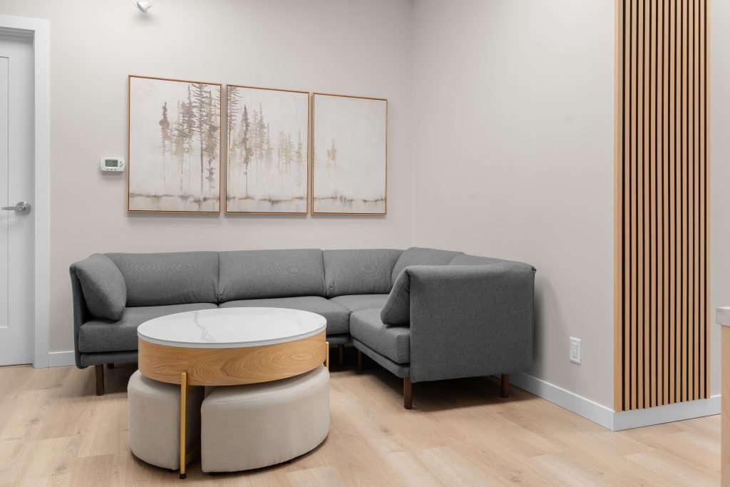
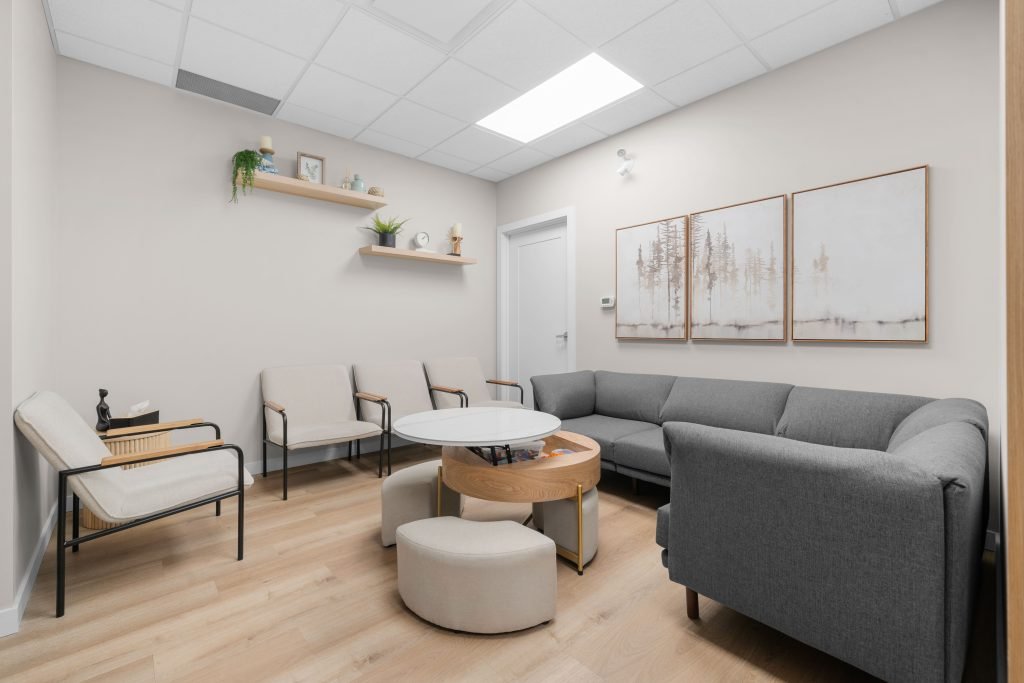
Reception Before
Playrooms
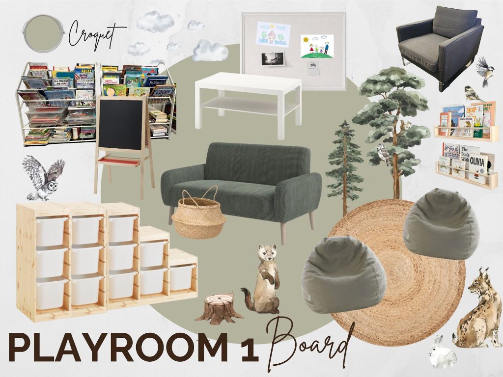
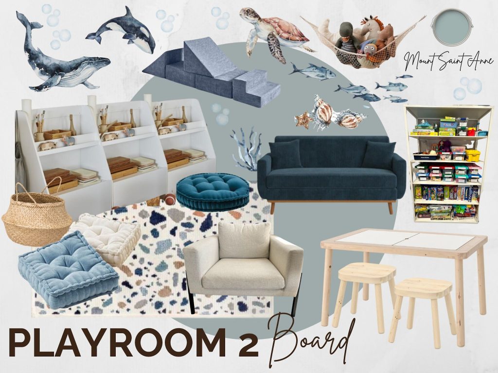
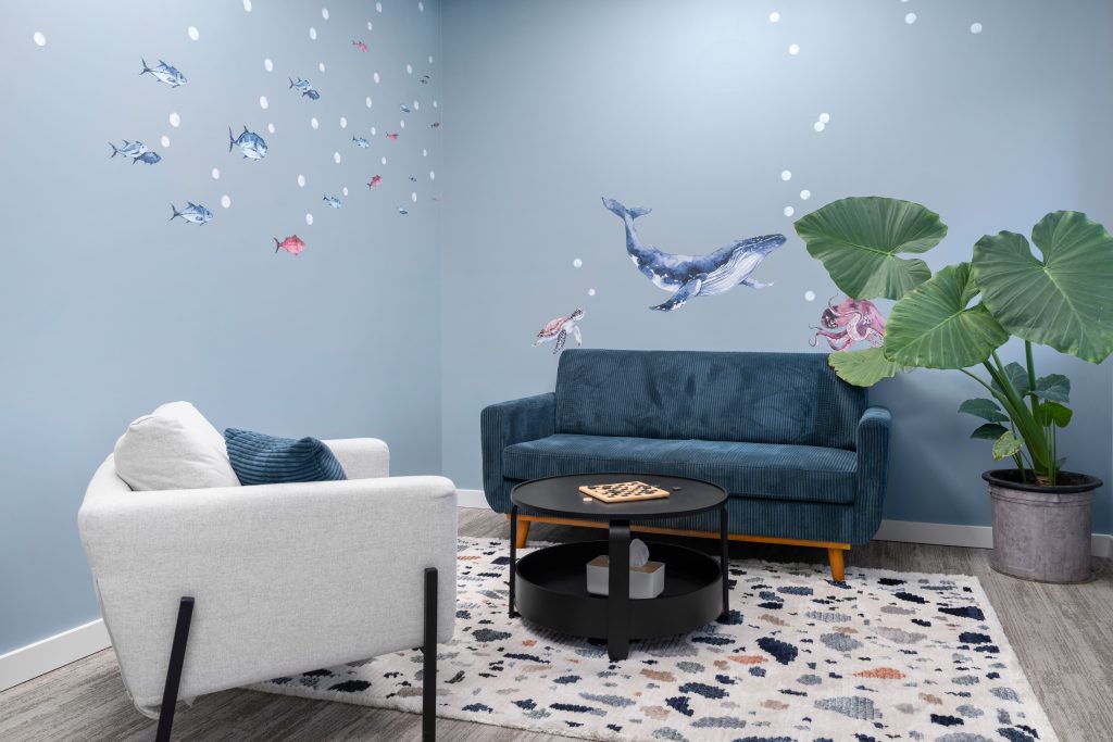
We were pretty excited when ‘two playrooms’ were mentioned in the scope – HOW FUN!
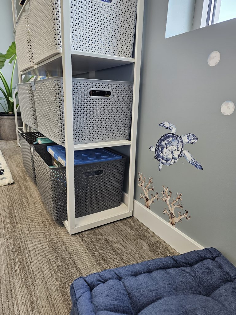
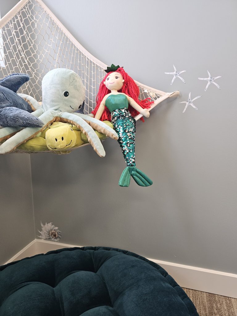
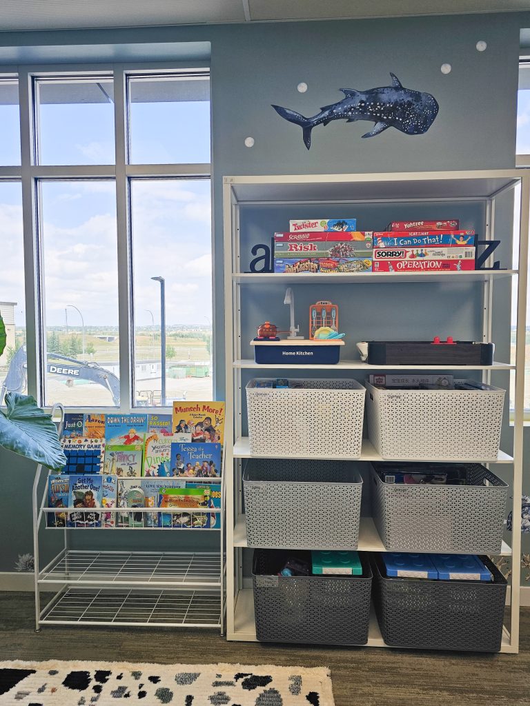
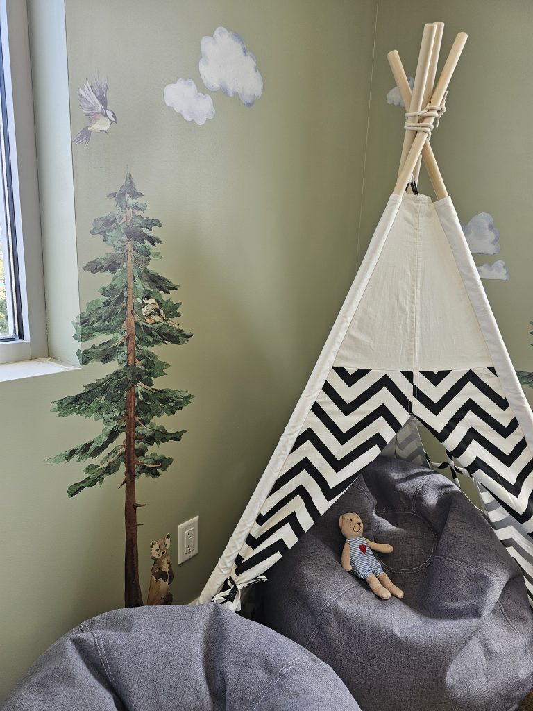
We were tasked with designing 2 unique playrooms that would encourage kids to play, while not becoming overstimulated. The theme was up to us. So staying true to the ‘nature’ theme we had introduced in the lobby, we chose ‘land & sea’ and styled accordingly.
Whimsical, playful, charming, and welcoming. These playrooms met and exceeded the brief and the feedback from our client on the huge smiles of her tiny client’s is all the thanks we need.
(but please never ask me to put up a 5 foot tree decal again… lol!)
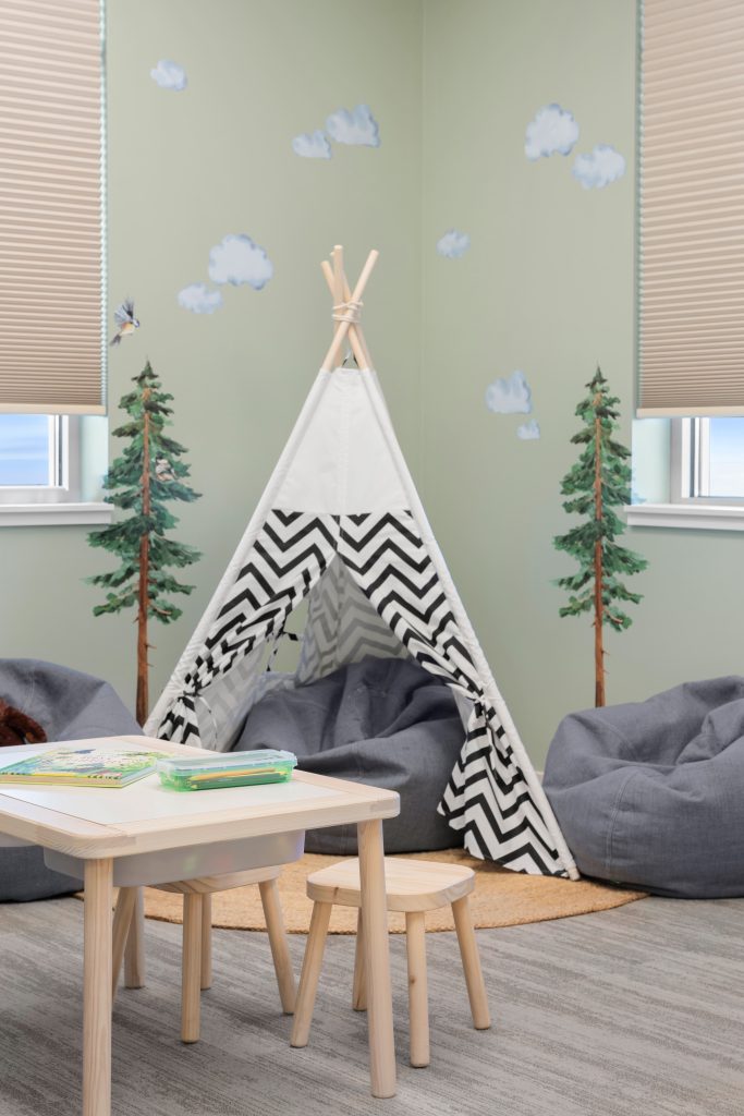
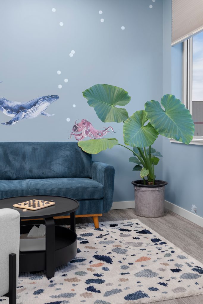
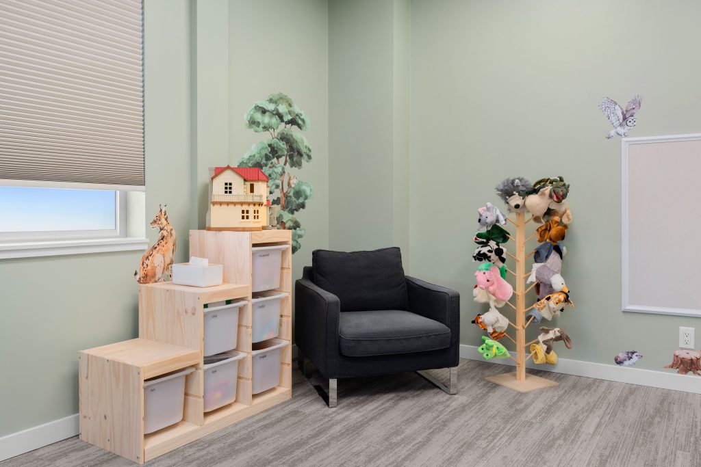
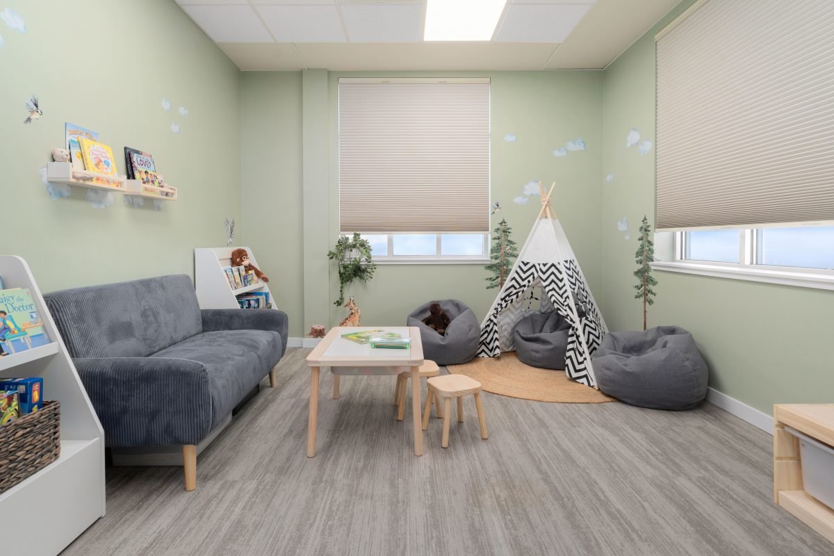
We also selected new window treatments that would be consistent throughout the whole office space, and a warm creamy honeycomb was the perfect choice for heat and light protection, as well as a soft addition to the design.
Playrooms Details
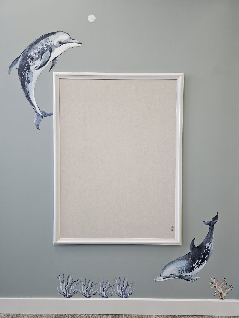
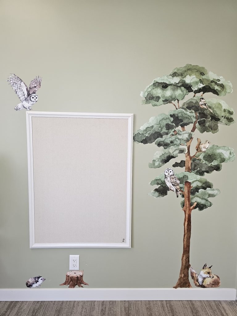
Playrooms Before
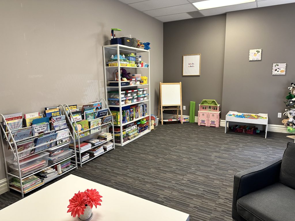
Bright Office
Our client gave us free reign on the design as long as we kept them feeling ‘calm and bright’. There were three offices and we chose to treat them all completely different, offering a new and fresh experience for their staff and clients.
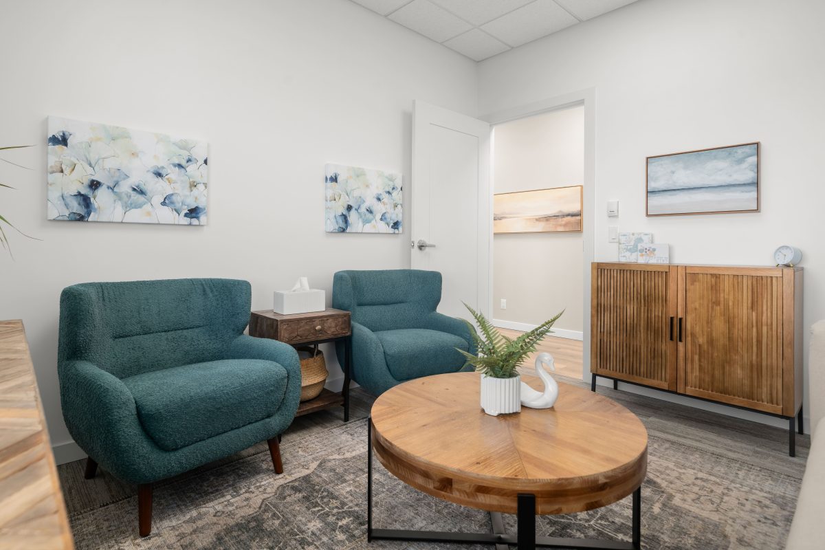
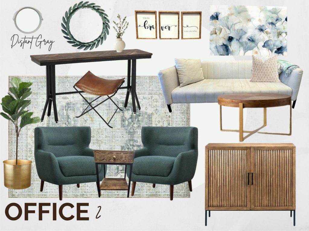
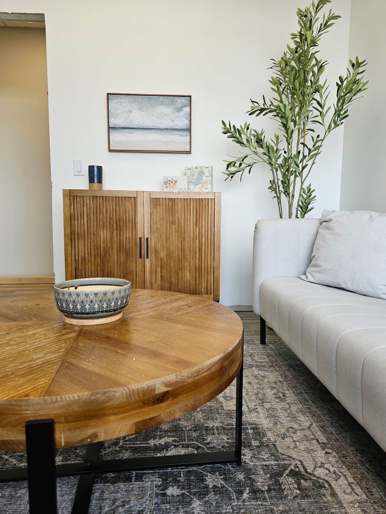
This first office is the ‘bright’ office, which had bright white walls and decor, and warmed with oak, blues and greens. This beachy vibe is the holiday you’ve been waiting for.
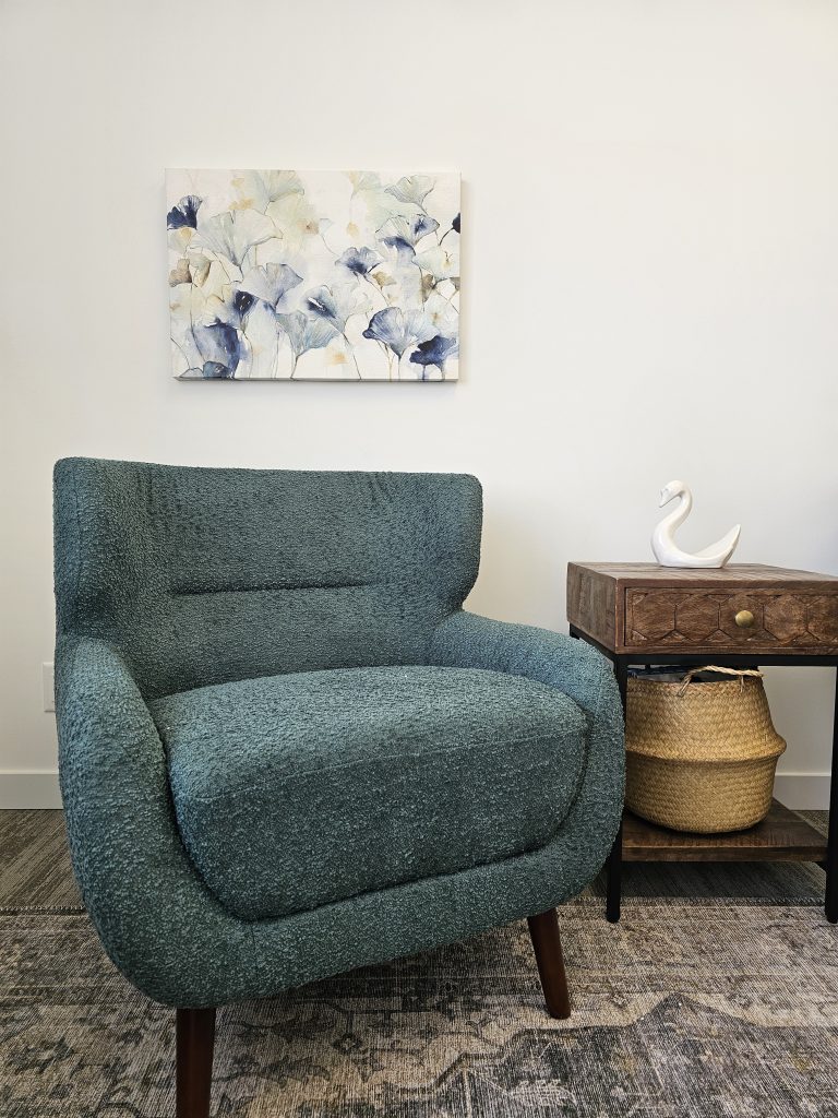
The client had an existing couch she wanted us to repurpose, which we paired with these 2 unique full-bodied colourful chairs. The wood tables, cabinets, and consoles keep this space feeling relaxing, rather than leaning too ‘contrast’.
And how perfect is this art? It pulled the exact colours we needed and grounded our 2 chairs.
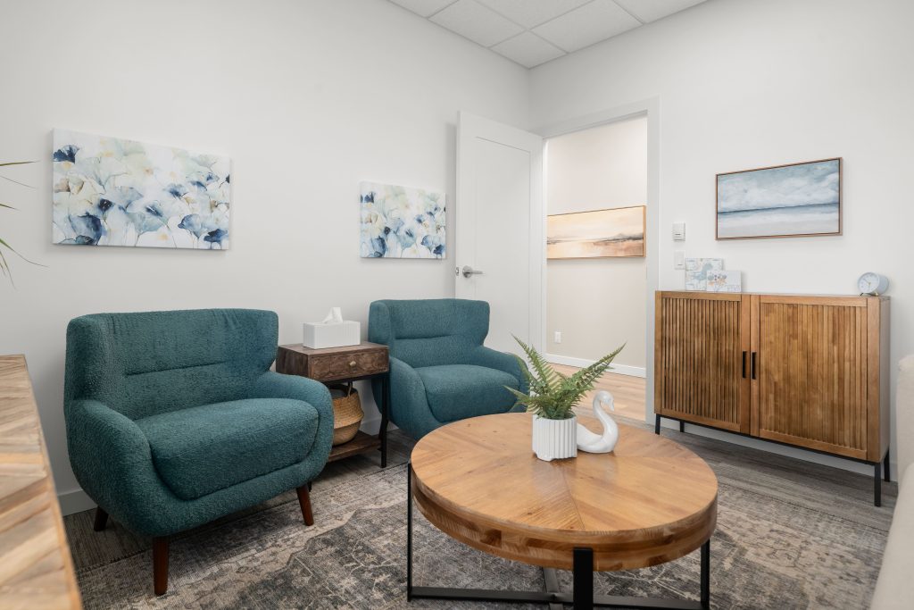
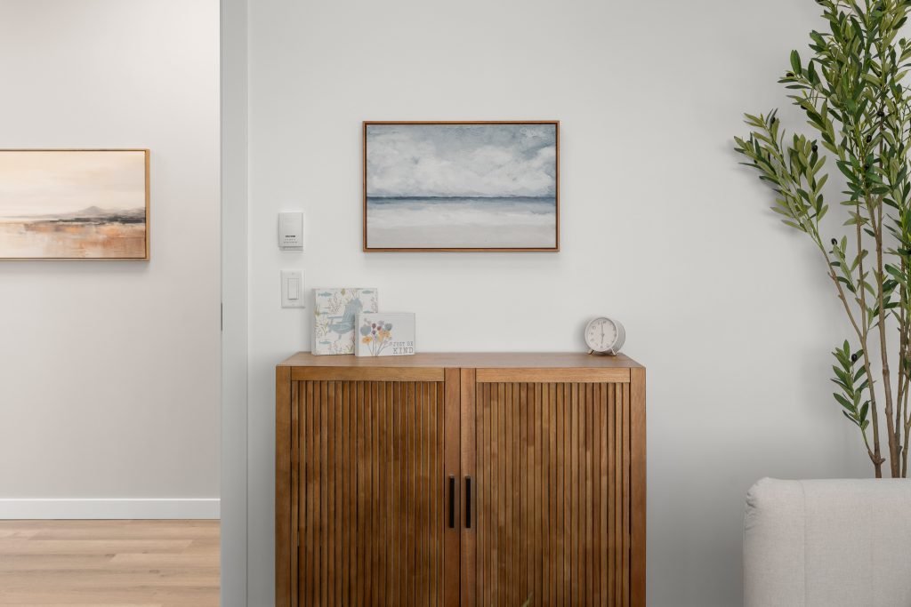
Bright Office Details
Bright Office Before
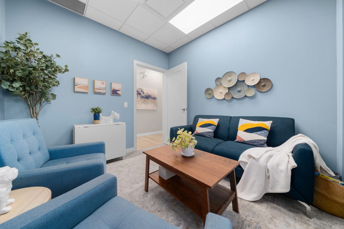
Tranquil Office
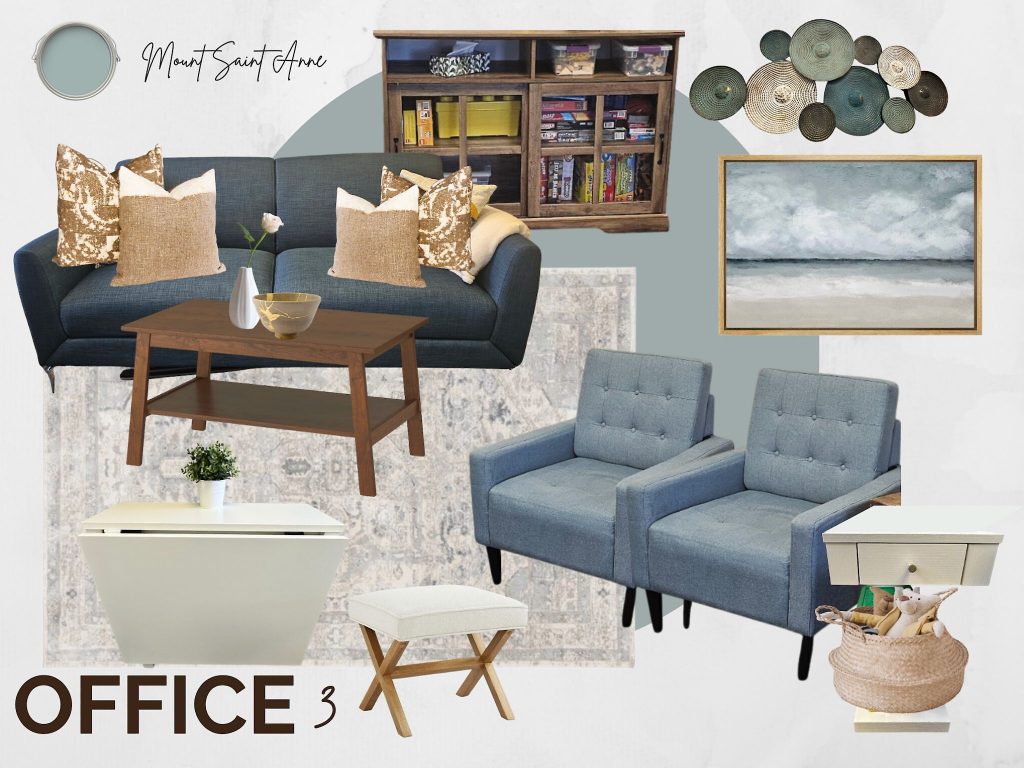
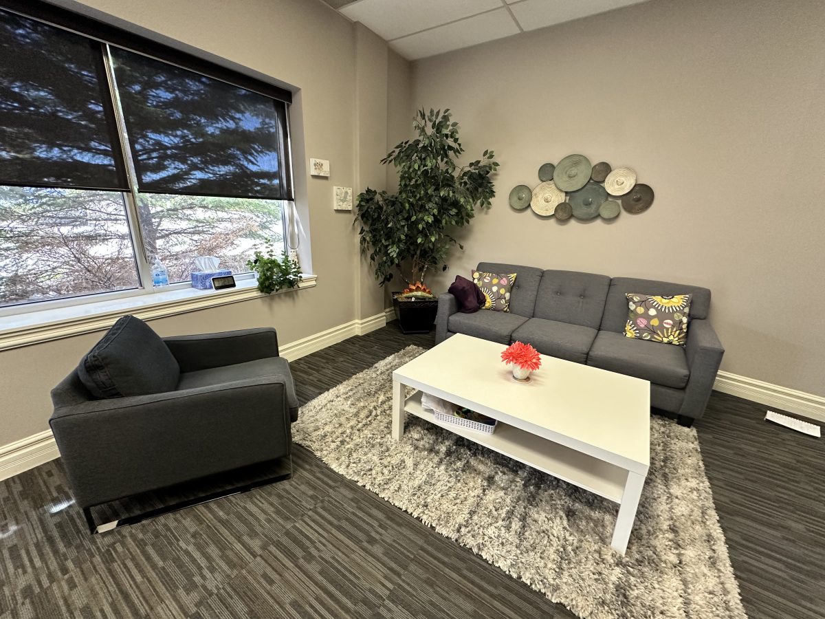
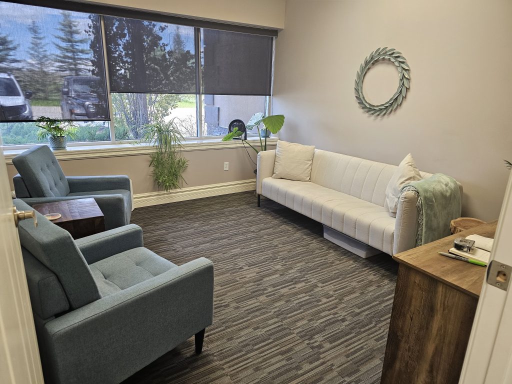
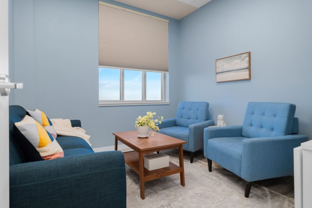
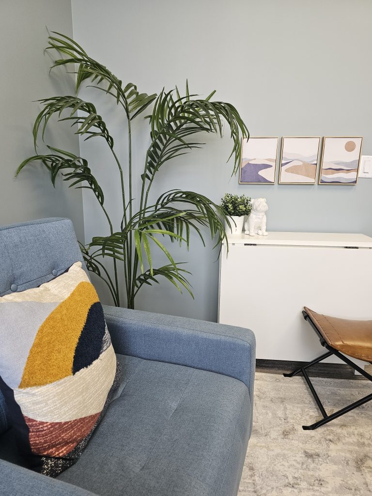
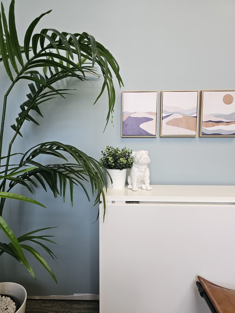
The tranquil office is like being able to finally breathe. We repurposed most of the client’s existing pieces (couch, chairs, cabinet, console, faux plant, and metal artwork) from their old location and chose supplementary pieces to give it direction.
The soft blue walls wrap around you as soon as you open the door, and the pops of colour keep you energized (there is work to be done in here after all!).
Tranquil Office Details
Tranquil Office Before
Earthy Office
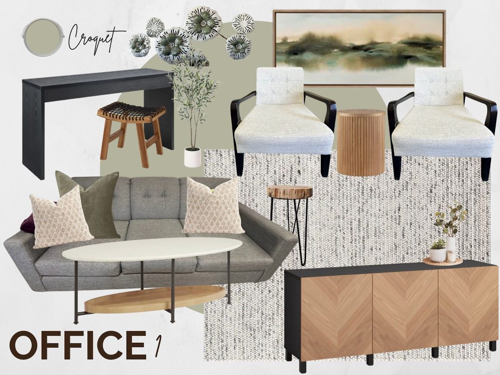
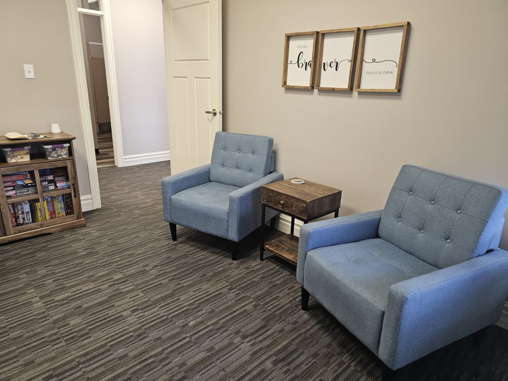
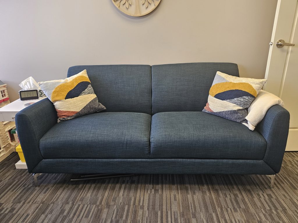
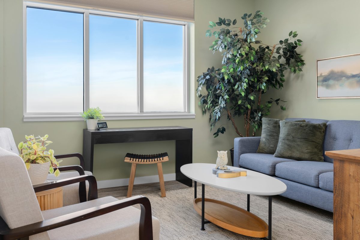
The earthy office is a staff favourite. This room again was supplied with the client’s existing couch and chairs from their old space. Full transparency – this grey couch was not my favourite for this room, but the other 2 couches fit the other 2 rooms so perfectly we had to make it work.
Again we warmed up the space (and offset that grey couch) with light wood accent furniture, and decided to pull in black for contrast. The soft mossy green paint helped to give the client’s faux plants a home, which led us to the ‘forest’ theme.
What developed was an earthy office that gave the calm of a walk in the woods.
Testing Room
This was a very unique room that we definitely have not been asked to do in a residential space (but never say never). The client wanted a room where client’s could complete tests and be monitored by staff. But what’s more, they wanted a viewing room through 2-way glass into this room, with seating for the lead therapist.
When we first looked at the plans we realized that there had been an error on the floor plan, and what should have been a full viewing room was actually just put as a closet. So we worked with the contractor to make some adjustments (unfortunately losing some storage space) to expand the observation room as much as we could. We were able to create a full size testing room accessed through the main hallway by the offices, with a narrow observation room that had 2 chairs and a desk, accessed through the staff storage area.
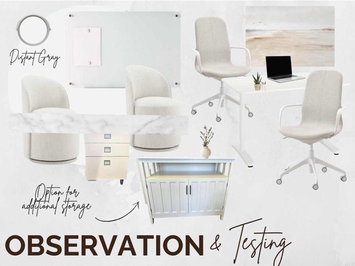
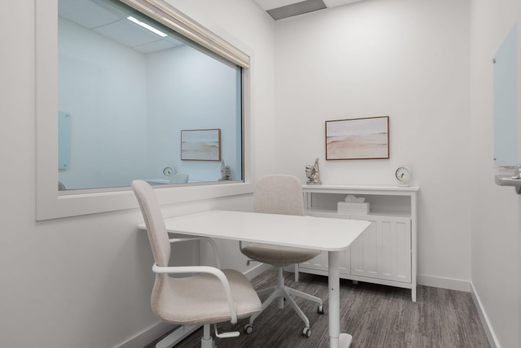
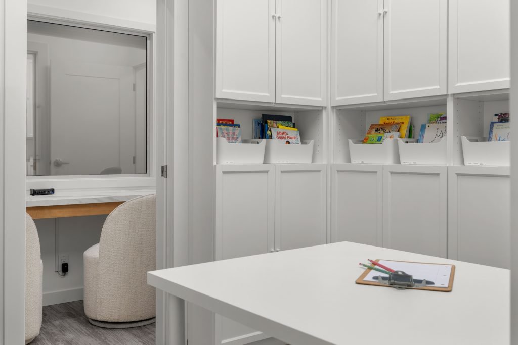
We kept the design of this room distraction free and chose white-on-white-on-white, with only soft and positive decor pieces. And thrilled we found 2 swivel chairs small enough to fit the narrow observation space. We also carried the same countertop used in the reception and kitchen (see below) into the observation space.
You can also get a quick glimpse at the storage room which we designed purely with IKEA for cost purposes, and made use of every square inch we had left after the floor plan change.
Kitchen & Bath
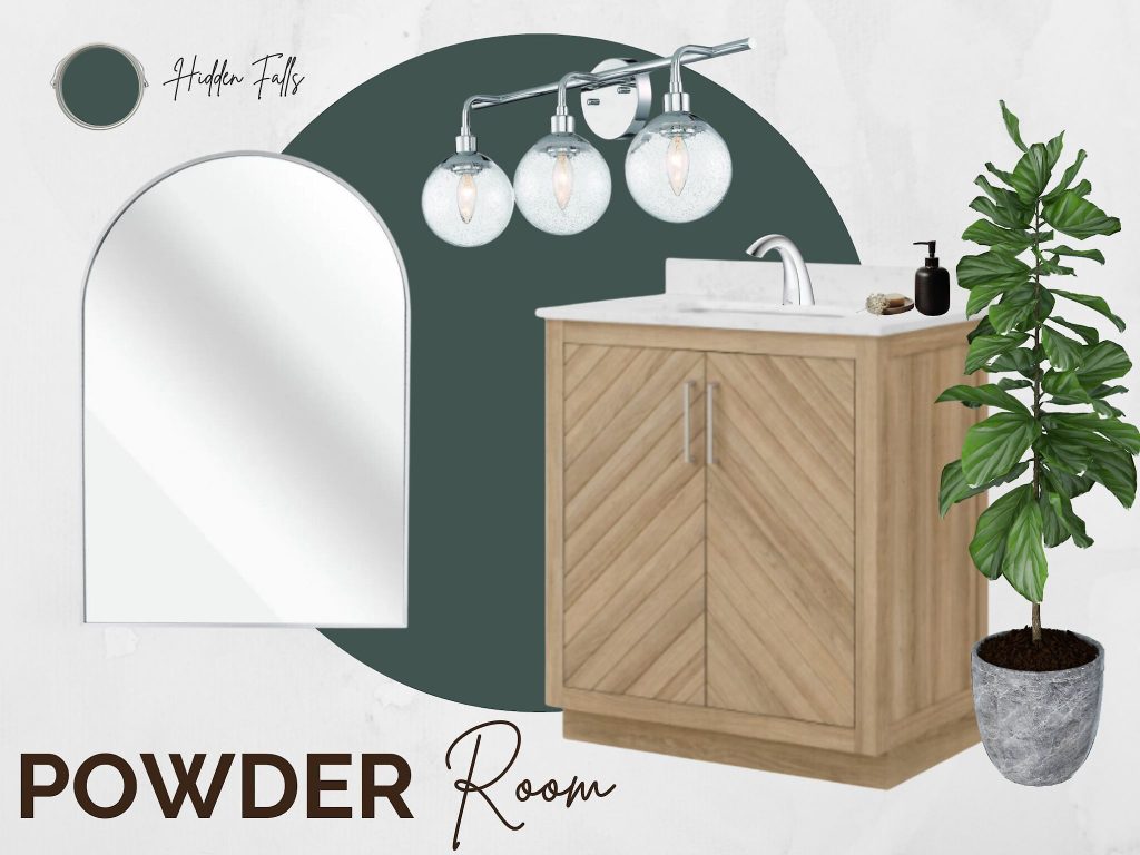
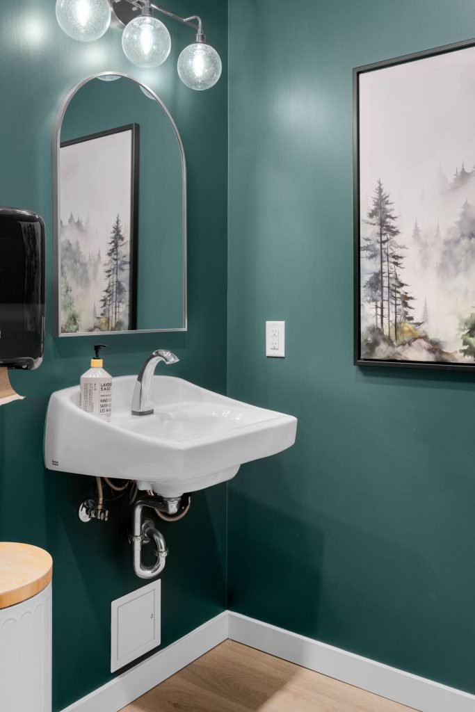
You’ve seen a lot of creams and calming colours throughout this design, but sometimes a burst of colour is begging to come out. We get this burst of colour in the bathroom, choosing a rich green (which we also carried onto the front door if you noticed). Dark and moody, and nature-based, this bathroom is a joyful surprise to anyone lucky enough to have nature call during their appointment! (pun intended).
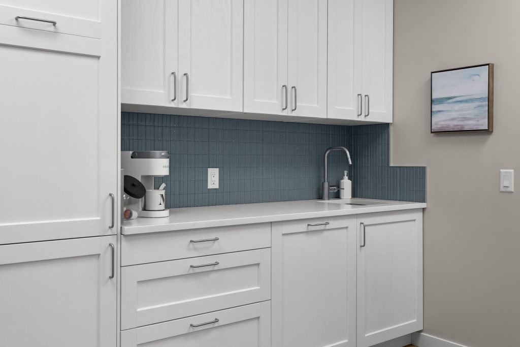
Because of it’s small footprint, we didn’t want the kitchenette to get lost in the design, and I found the perfect tile (muted & fluted) – this tile matched the fluted wood in the lobby (which can be seen at the same time) and the peaceful muted saturation prominent throughout the whole office space. And that little piece of art? The cherry on top!
The client was unsure at first but trusted the process and is now in love with it.
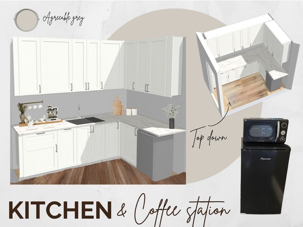
The kitchenette had a bit of a transformation between design and install. The building plans changed (communal accessible bathroom in hallway removed) and so what was supposed to be the kitchen became an accessible bathroom. We pivoted to a smaller bar-style kitchen in the hallway.