Modern Killarney English Cottage
Interior Design & Furnishing Moodboards
Our Calgary Killarney client wanted a modernized ‘English Cottage’ design that would highlight the existing wood cabinets and key furniture pieces they already owned. The primary goal of the redesign was to brighten and freshen the main floor, moving it away from the poorly stained hardwoods, black island, and cheap metal lighting. They wanted the home to be sophisticated and welcoming while staying true to its more traditional architectural features, including arched doorways—something we were happy to embrace!
Not only did we create a design for the home through material finishes, we also created mood boards for the various rooms on the main floor to help guide our clients in their furniture purchases, which they successfully executed.
Sitting Room
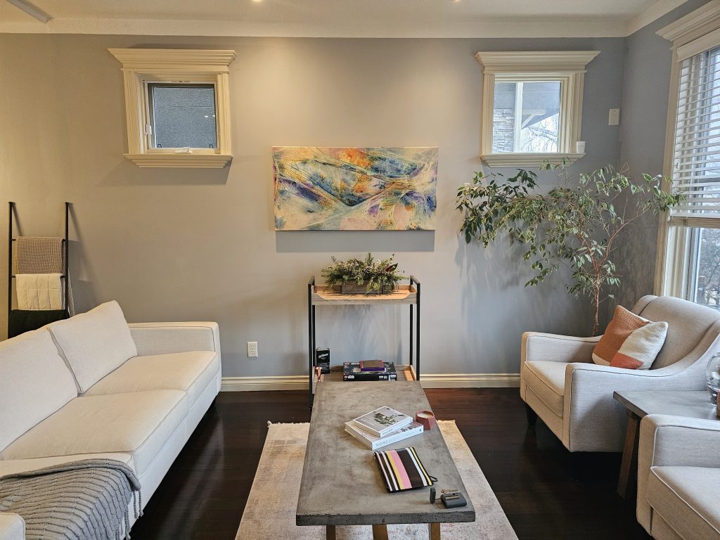
We chose a warm, creamy paint color for the entire house, replacing a cooler blue that the clients no longer liked. We also had all the baseboards and casings painted a pure, fresh white to replace the creamy pink-beige that clashed with – well – everything.
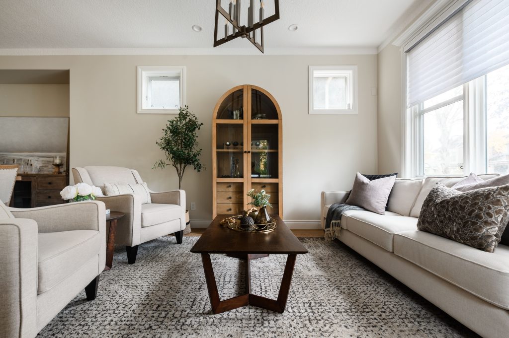
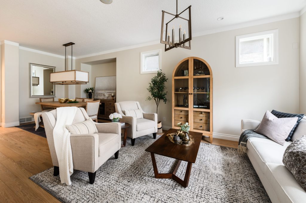
New window treatments filter the light beautifully in this front sitting room, and when the sun goes down, the unique and stunning chandelier lights up the room. Originally, there was no junction box for the chandelier, so we had one added to help ground the space.
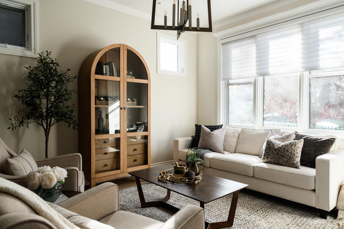
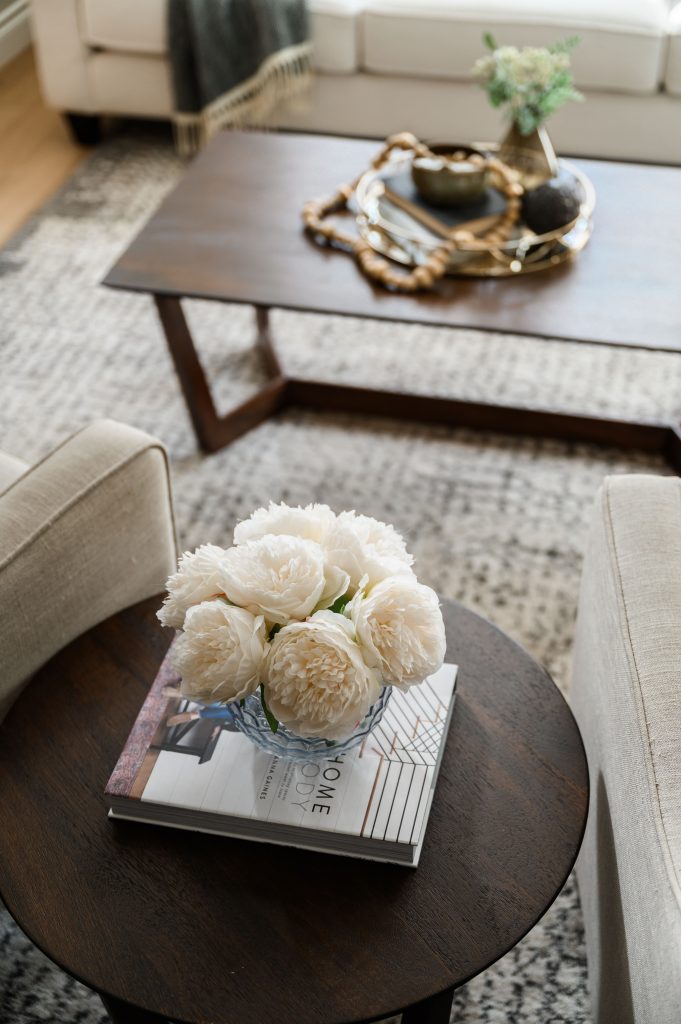
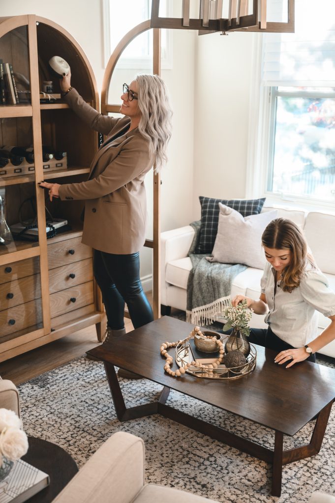
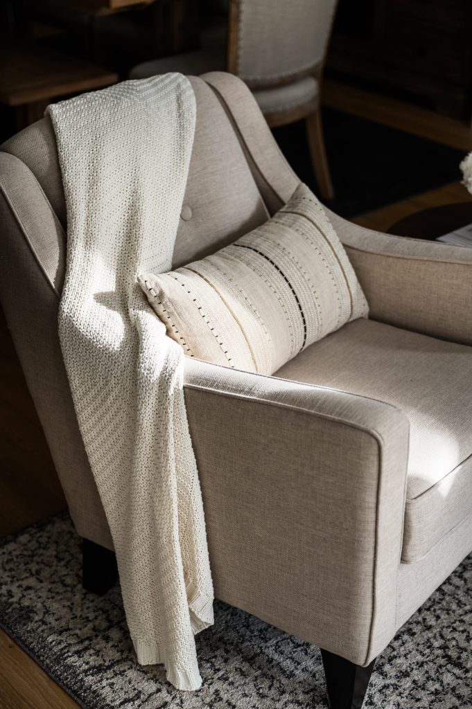
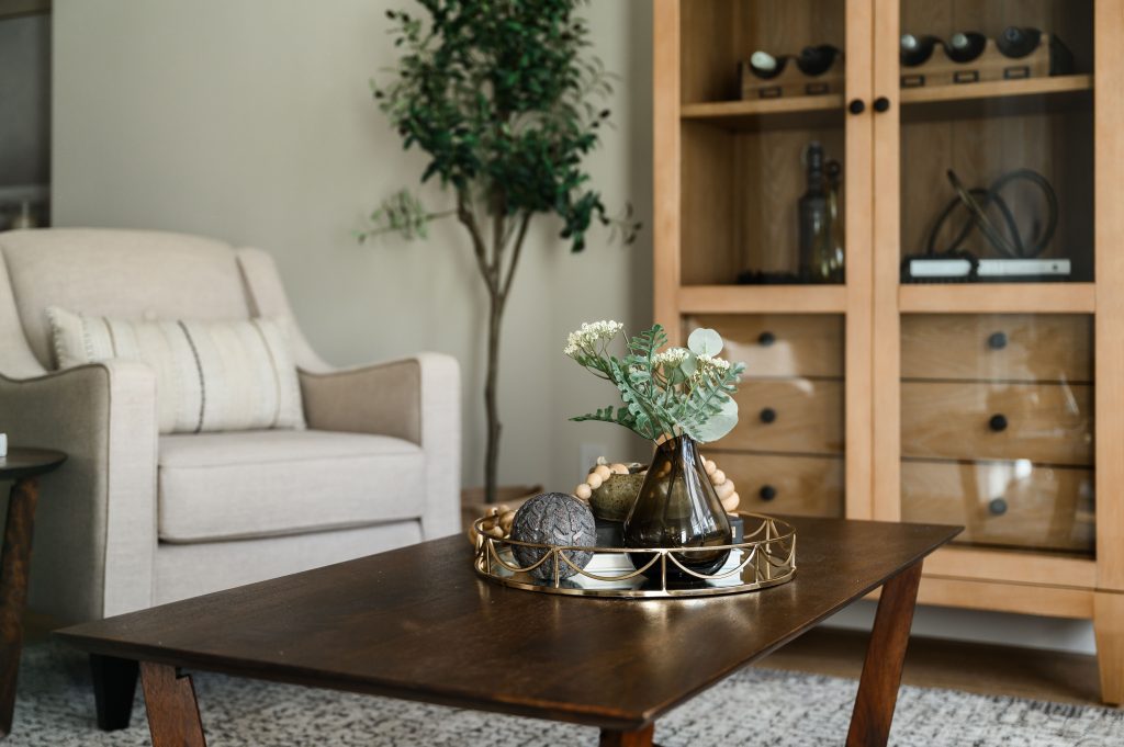
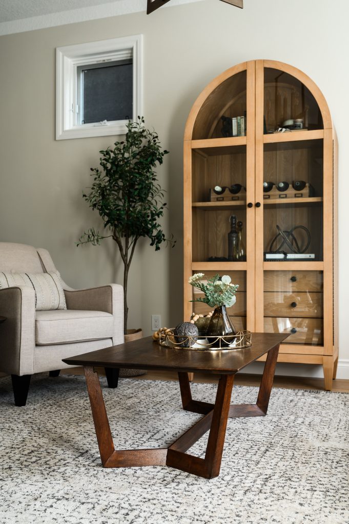
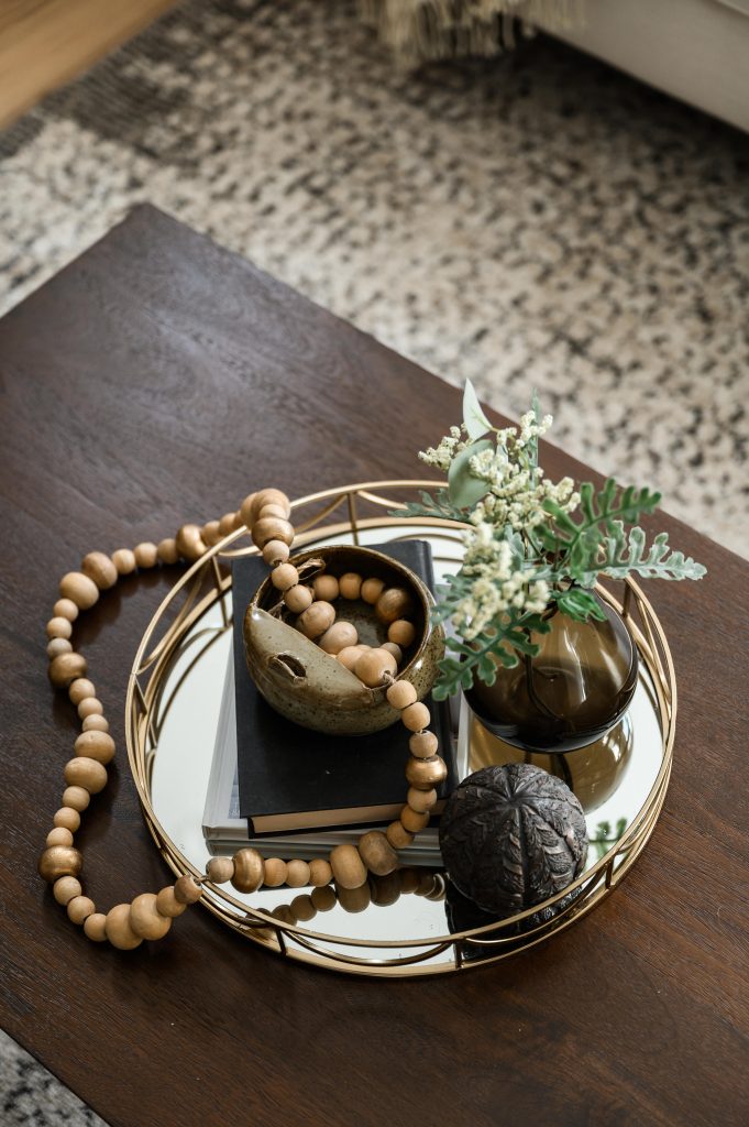
Our client already had a lovely sofa and occasional chair set in their sitting room, which we designed around. Originally, the layout was swapped, which closed off the room and made it feel small. As part of the furniture plan, we laid out a new orientation that allowed for a cabinet on the far wall and provided more styling opportunities to make it feel homey.
Sitting Room Before
Dining Room
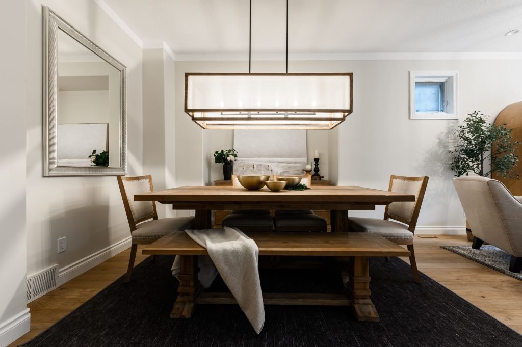
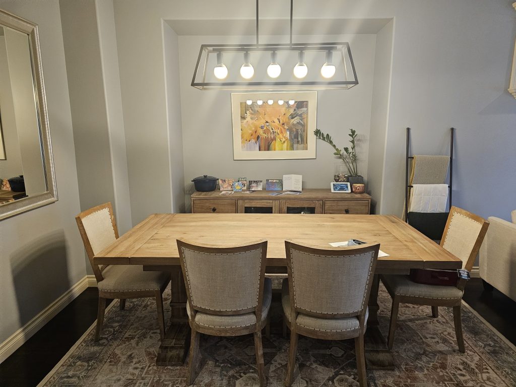
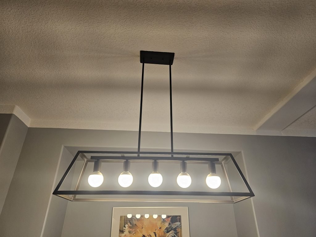
As soon as we saw this dining fixture, we knew it had to be part of the design. In truth, it is my favourite light fixture that I have ever installed in a home. The two-tier warm wood frame and linen fabric shade perfectly complement this English cottage style and the client’s dining set (a set we would have specified had they not already owned it!). Oversized art, intentional styling, and a new contrasting rug wrapped this dining room in a hug (both metaphorically and literally, as I am pretty sure I hugged the light box when it arrived).
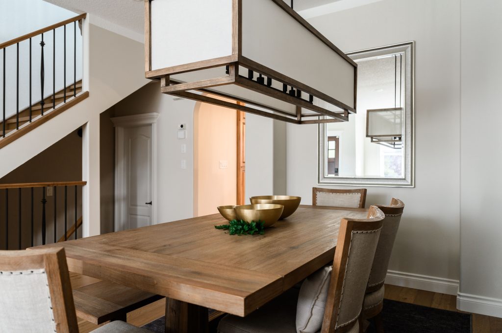
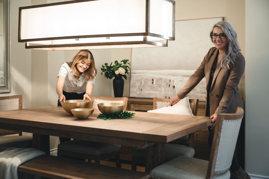
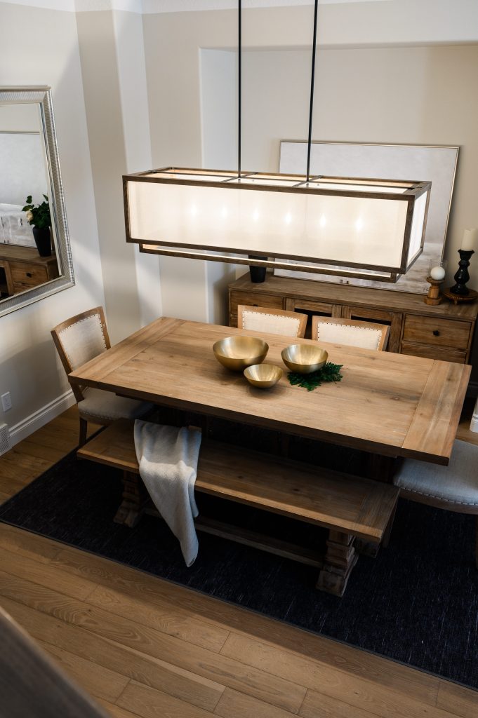
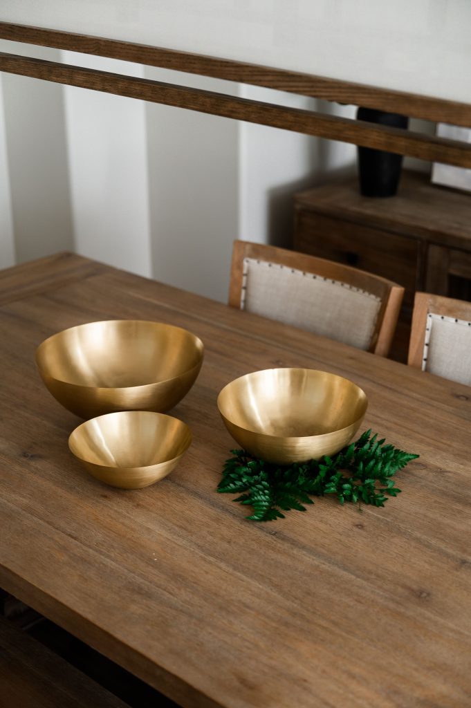
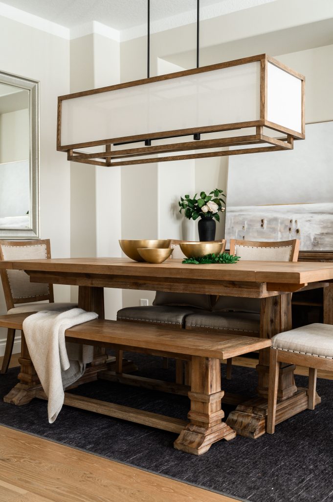

These brass bowls make a cameo in most of my designs, and this combinationof brass and wood is a reminder of why I will continue to use them for a picture-perfect finishing touch.
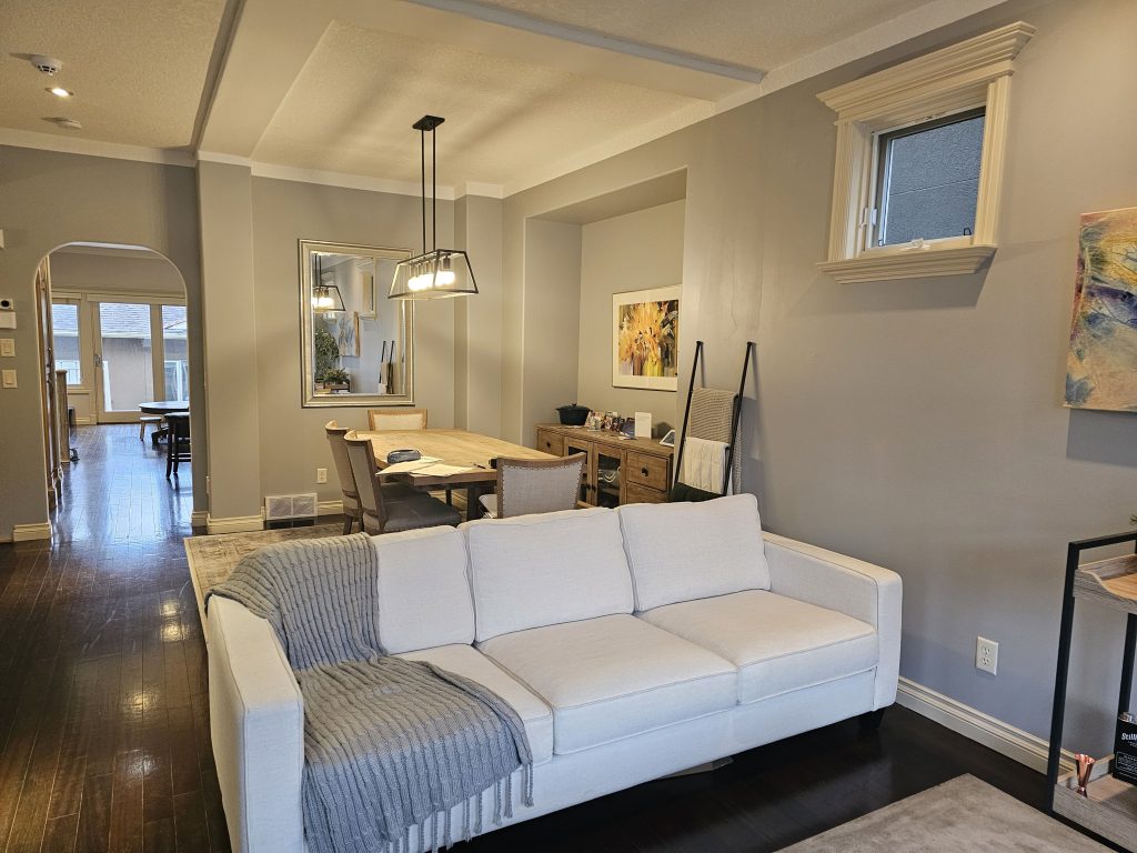
Dining Room Before
Kitchen
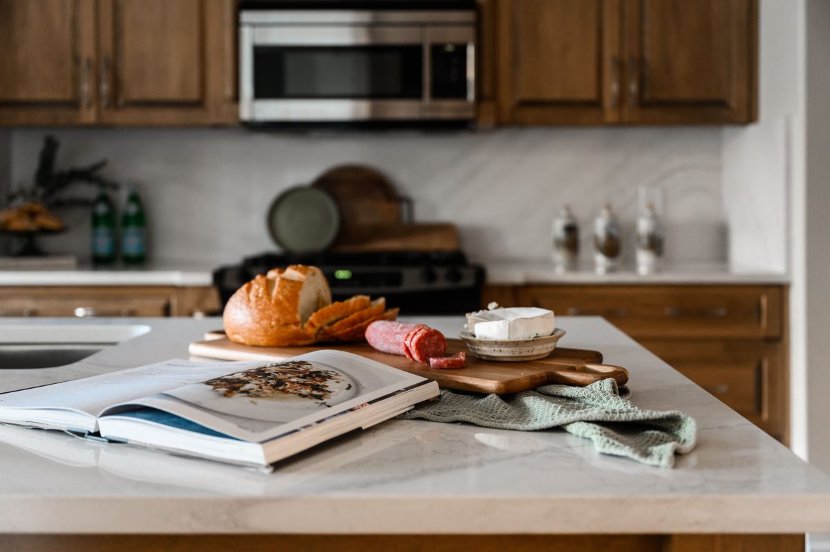
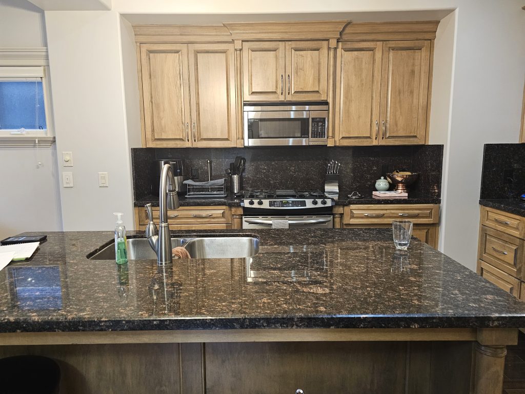
We were fortunate to work with such a beautiful tone of wood on the kitchen cabinets. Typically, we do our best to mask the orange glow of oak cabinets, but in this case, the tone was exactly what we would have chosen for this design scheme. However, the black countertops and backsplash created a very dark kitchen. Our first design decision was to tear out the black granite and replace it with fresh white quartz featuring both warm and blue veining for a new take on ‘cottage’ (perhaps a lakefront cottage?).
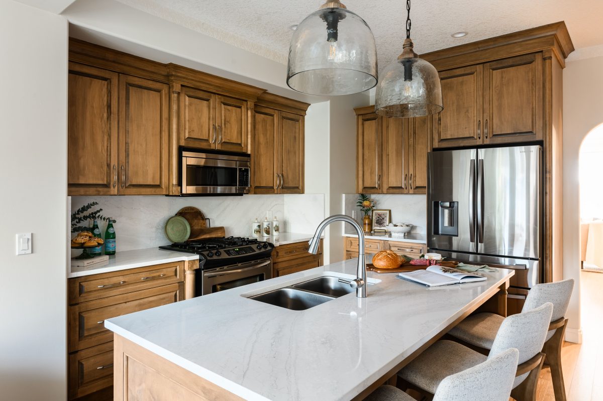
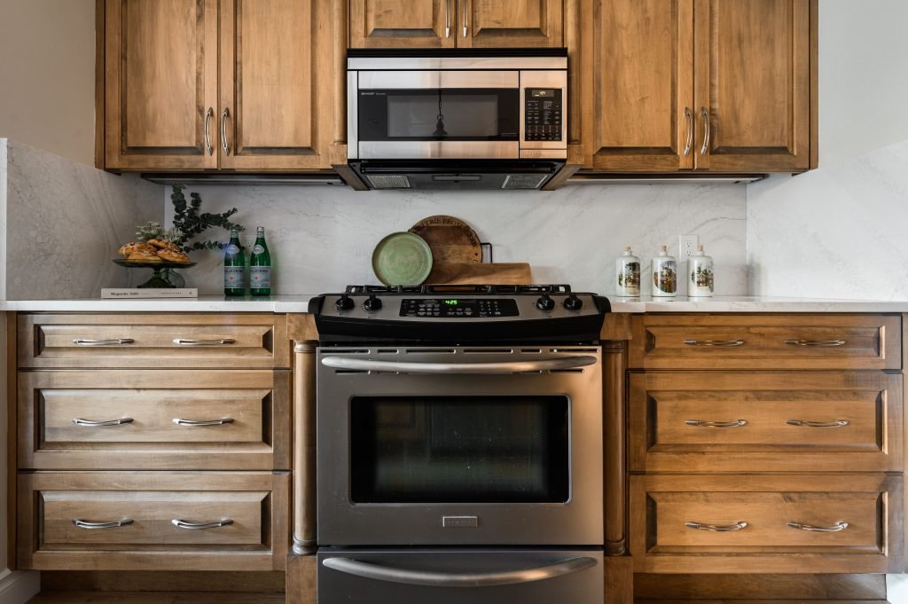
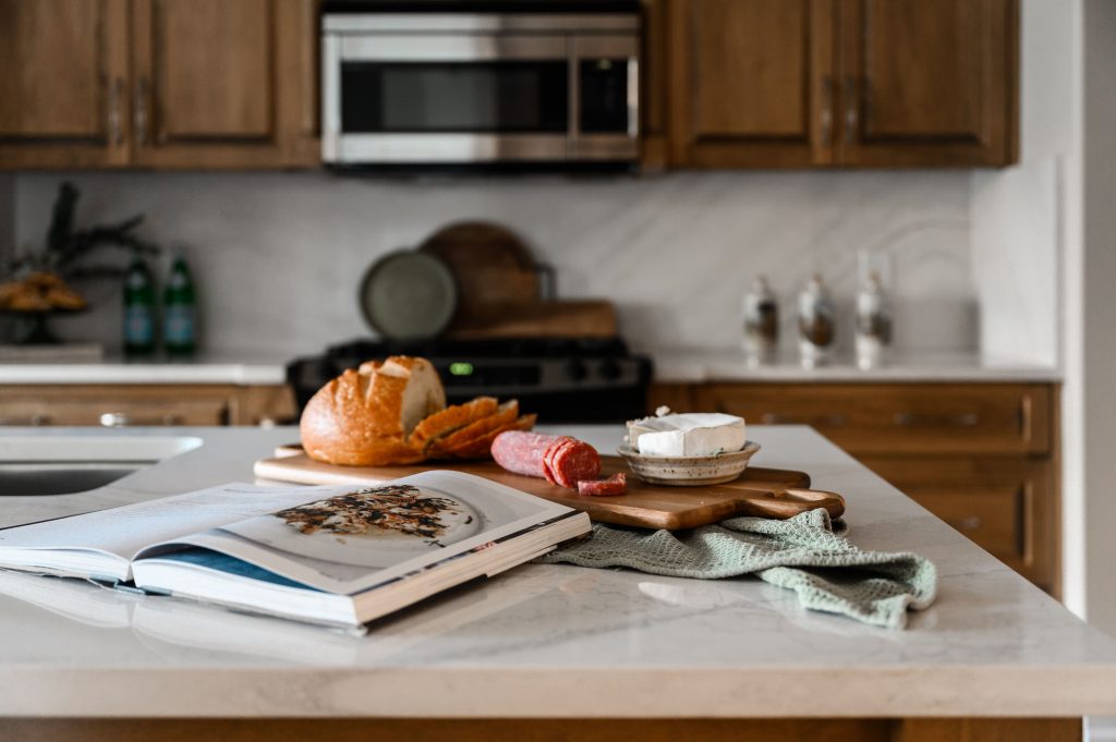
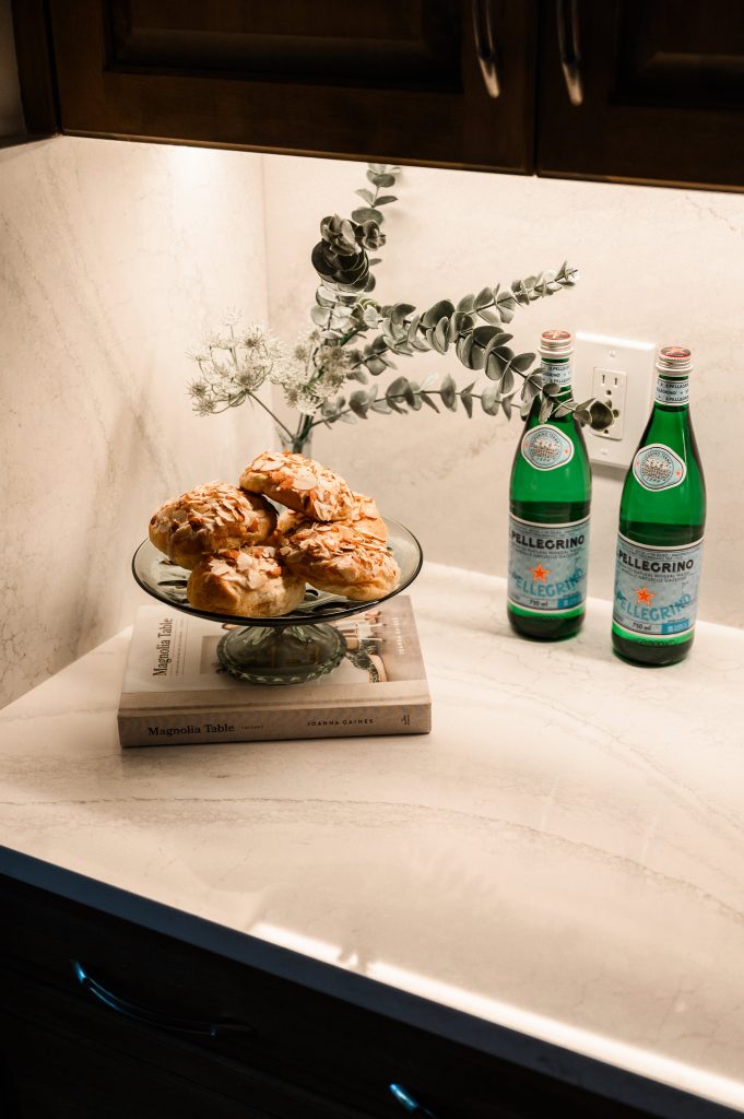
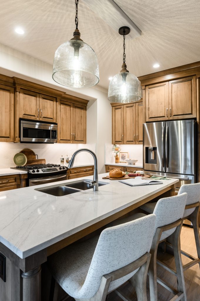
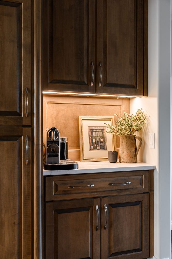
We replaced the outdated black metal ‘Home Depot’ light fixture above the island with two hammered glass pendants featuring wood detailing. Our clients wanted the pendants to hang high enough to see the living room TV, so we chose visually light pendants that would not look out of place at that height.
Kitchen Before
Living Room
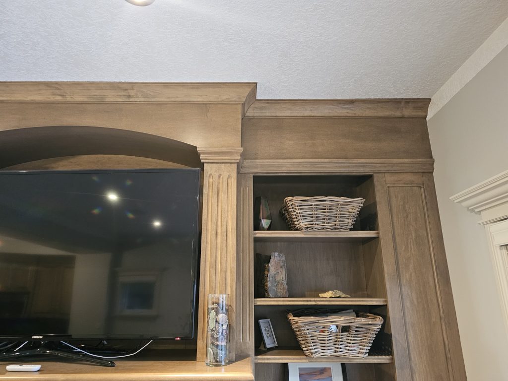
If you do not follow us on Instagram, you are missing out on a fun shelfie competition reel we created.
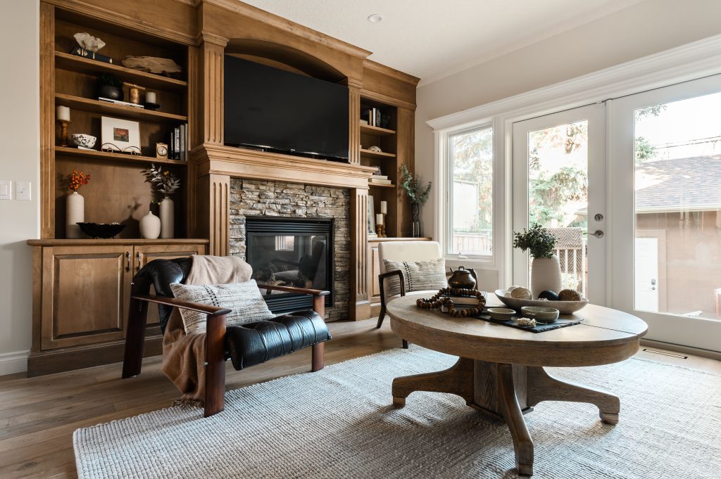
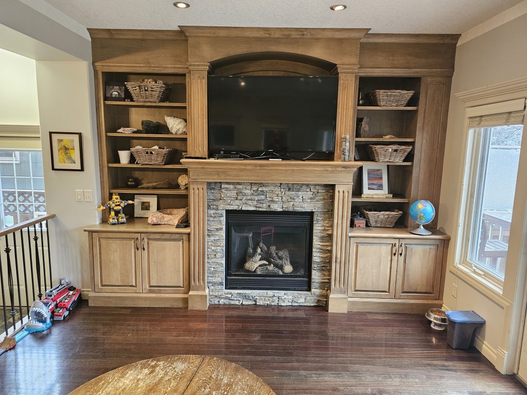
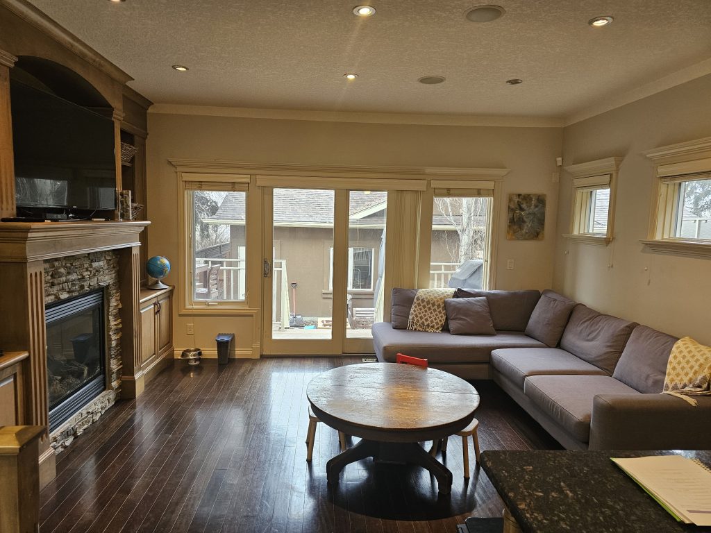
Based on our moodboard for furnishing inspiration, our clients furnished this living room with a mix of rich leathers, fabrics, and wood, along with an area rug that the room so desperately needed.
In in terms of renovations, we changed the back door to include larger windows, both inset in the door and flanking the sides, in bright white, which elevated this previously dark living room.
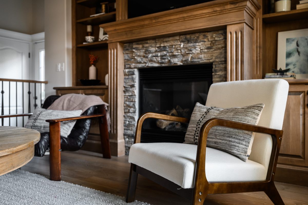
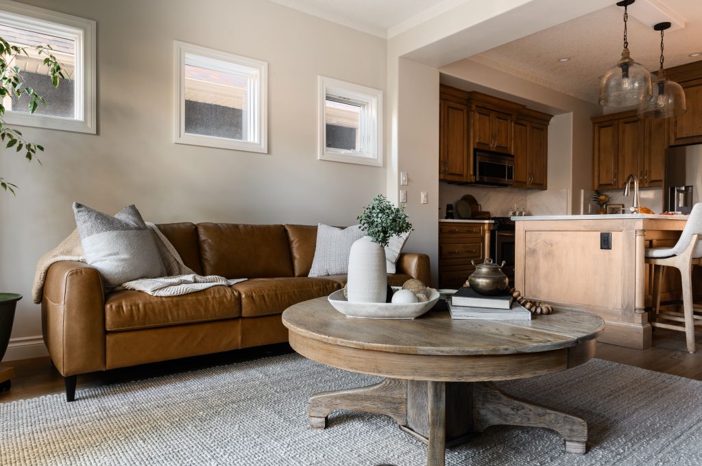
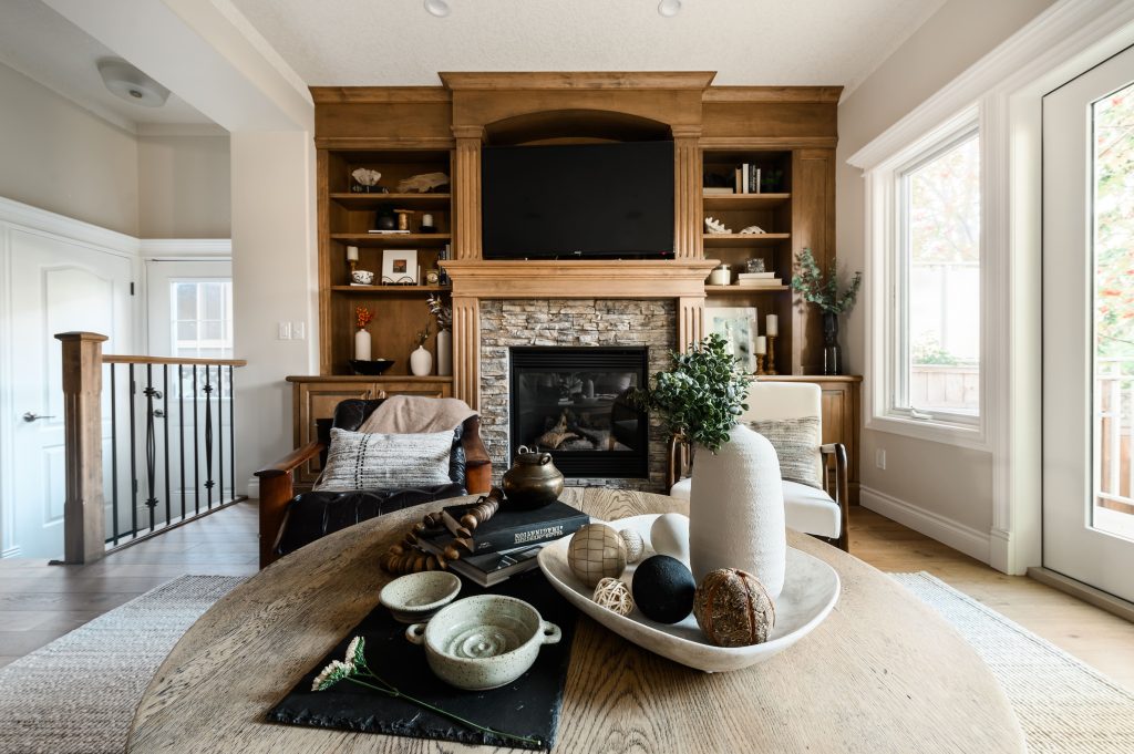
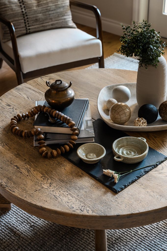
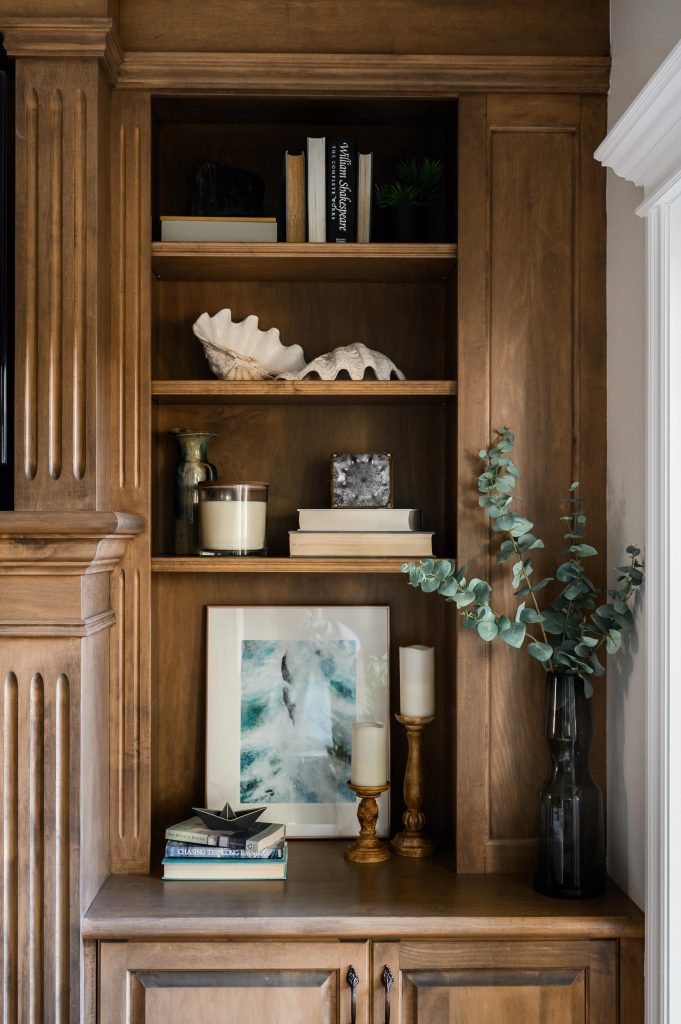
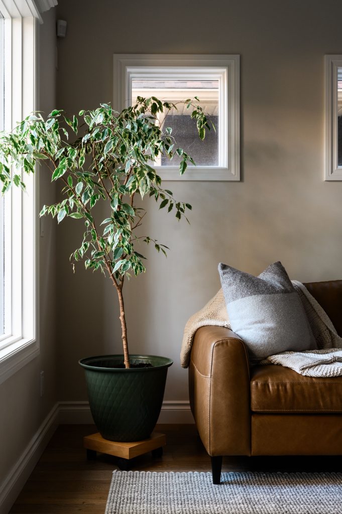
We love how the styling of this space turned out. We used a variety of earthy raw materials, reflecting our wabi-sabi dream. The brass and greenery juxtapose each other naturally, while the clay and stone make this house feel like a home.
Living Room Before
Entryway/Stairway
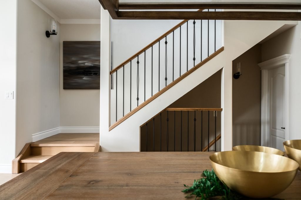
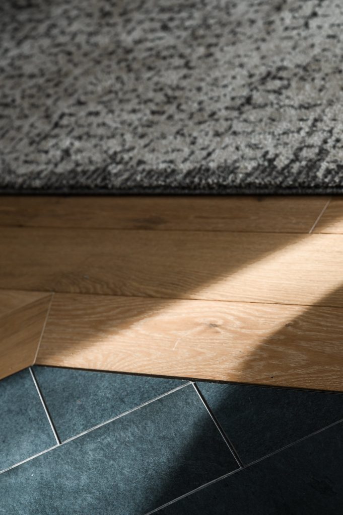
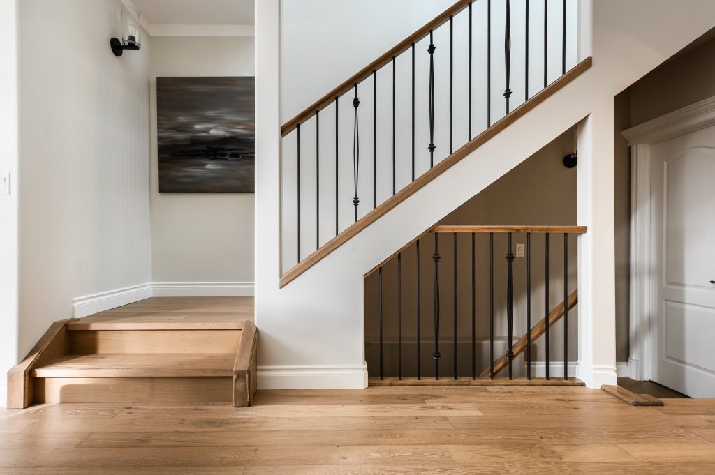
With so many rugs defining spaces throughout the main floor, this was our best opportunity to introduce the actual star of this design – the hardwood floor!
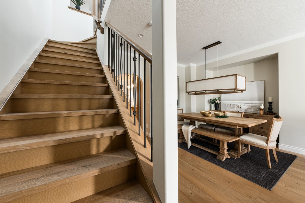
The client had previously hired a company to stain their original narrow plank hardwood floors, which turned out blotchy and dark. We replaced those with an engineered hardwood that was a lovely complement to their existing wood elements, featuring the same tone but slightly lighter in colour. It perfectly suits the space so well that it looks original.
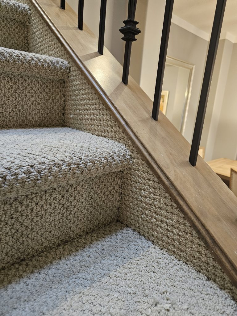
This flooring was carried upstairs, replacing the carpet throughout the second level.
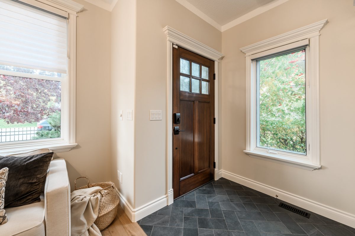
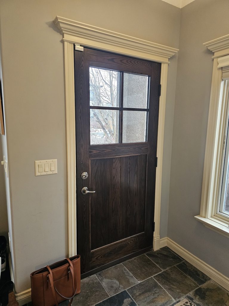
To address some obvious problems in the entryway, we sourced a new fibreglass door to replace the rotting original front door and replaced the busy, uneven, outdated tile with a modern black slate, which we laid in a herringbone pattern. This created a rich contrast leading into the rest of the home.
Entryway Before