

A colour buried under volcanic ash for nearly 2,000 years just made a comeback. “Pompeii Blue”, once thought lost after Mount Vesuvius erupted in 79 CE, was recently uncovered in an excavation, proving that good design really does stand the test of time.
I recently sat down with Gurleen Sodhi, a journalism student at Mount Royal University—my Alma mater—to discuss what makes this discovery so fascinating from a design perspective.
You can keep scrolling for a quick summary, but I encourage you to read the full Calgary Journal article for all the fascinating details.

Discovery of Pompeii Blue
Pompeii Blue was buried under layers of volcanic ash for nearly 2,000 years until archaeologists recently uncovered it in a room at the Pompeii excavation site. This shade of blue is rare in frescoes (mural or wall paintings) and seems to have been reserved for highly decorated spaces.
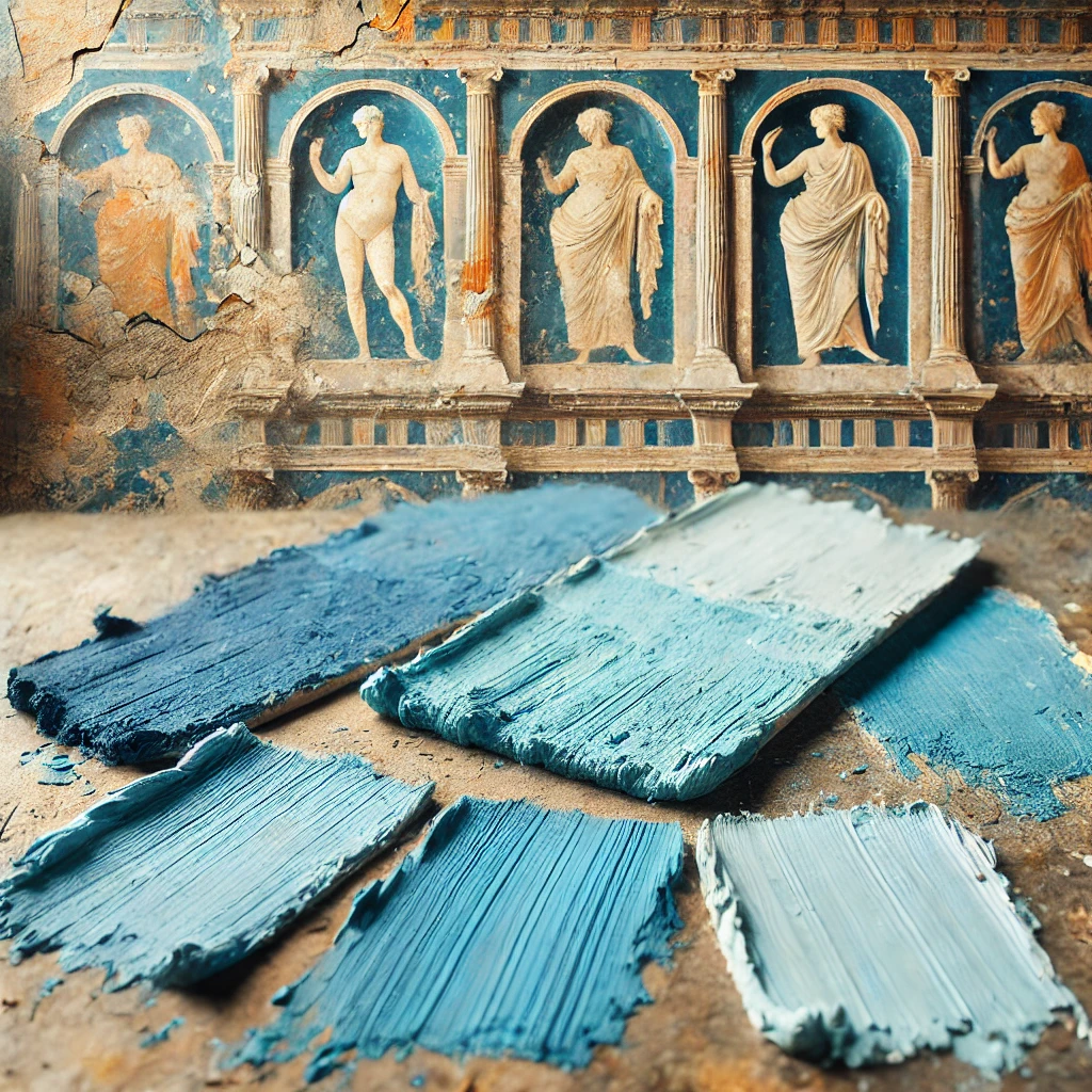
“Blues are timeless colours. Still honouring that history will make the colour popular.” – Sarah Kirkpatrick
Today, history buffs are bringing Pompeii Blue back to life by recreating the shade for modern interiors. It’s proof that great colours (and great design) never really disappear.
Why Blue?
In general, there’s something special about blue that makes it timeless. It’s a colour tied to emotion, often associated with calm, peace, and stability.
Learn about the psychology of colour and how it affects your mood.
“The colour blue and everything else you’ve done with your home should sort of envelop you— lower your heart rate and let you relax.” – Sarah Kirkpatrick
Interestingly enough, the colour has also been historically associated with status and significance. Before synthetic dyes, blue pigments were rare and expensive, so they became a sign of status, wealth, and nobility. Basically, if you had blue, you had taste (and probably a lot of money).
The discovery and recreation of Pompeii Blue for modern interiors gives us a very fascinating connection to the past and reminds us that design choices from centuries ago still influence us today!
Big thanks to the Calgary Journal and Gurleen for the feature. I always appreciate an opportunity to nerd out about colour!