
Modern Mountain V2
Interior Design & Furnishing
Welcome to Modern Mountain V2 in Calgary – round two with some of our favourite clients, and proof that when you get it right the first time… you earn a client for life.
After designing their ‘Modern Mountain‘ home in Killarney, this outdoorsy duo (a realtor and a mortgage broker, so yes—they know a good home when they see one) came back to us after their move to NW Calgary with a clear goal: bring back everything they loved, and adapt it for this new, larger home.
We carried forward the pieces, materials, and overall feel they already loved from our previous design (a real “say YES to the design” – again – moment), and thoughtfully expanded on them to suit a larger footprint and a completely different layout. Some furnishings found new homes. Others were paired in new ways. And where the space called for more, we layered in additional furniture, artwork, and decor to make everything feel complete, cohesive, and intentional.
When you already know how you want your home to feel, the second time around becomes less about discovery and more about refinement. What we designed is a home that feels instantly familiar to them, but thoughtfully reimagined for how they live today.
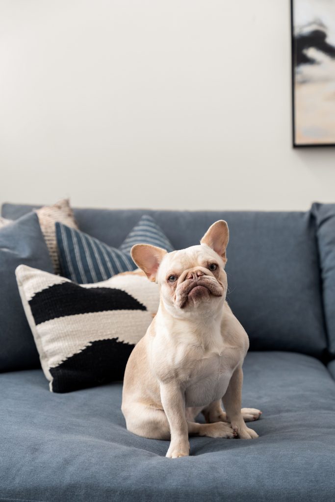
Oh, and of course, this is Chloe —>
Dining Room
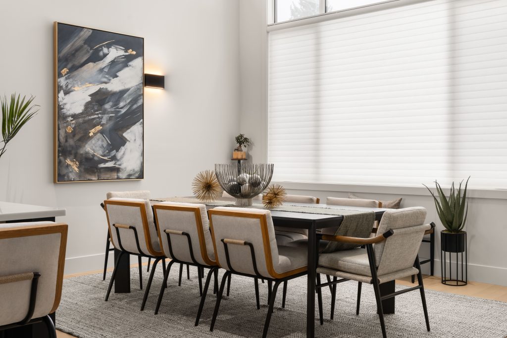
This dining room came together by working with what already existed—and knowing exactly where to add.
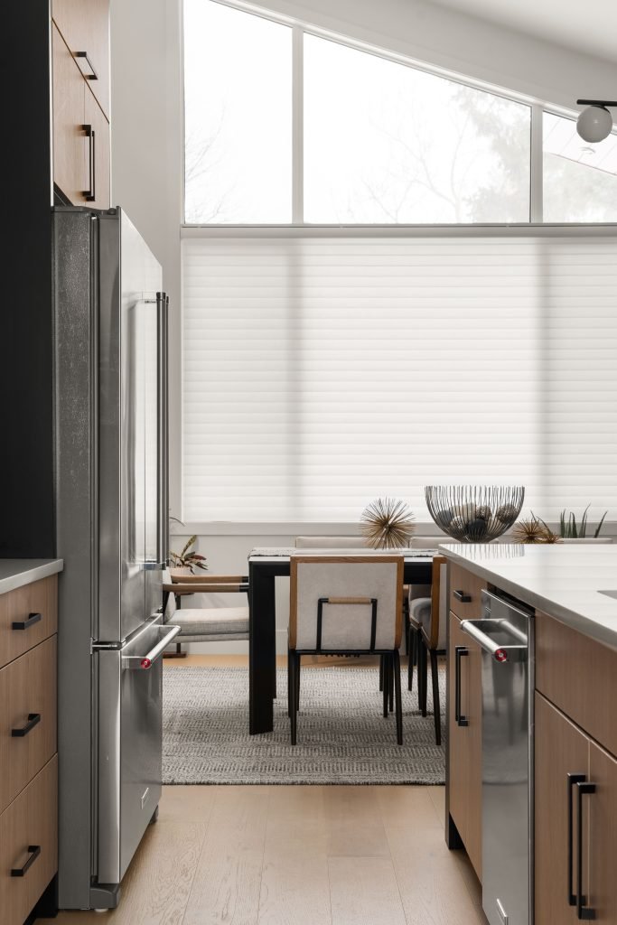
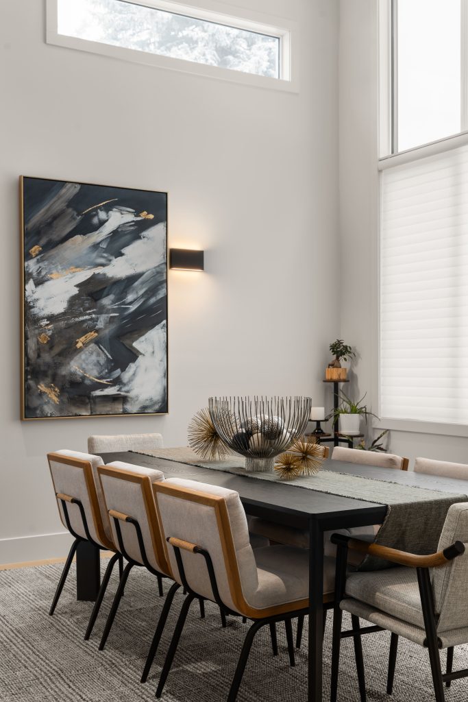
The table and chairs made the move with them, but this time we added two additional chairs so it could stay fully extended day-to-day. No more resizing for guests. Just ready for a full house at any time.
One of the biggest shifts happened underfoot. In their previous home, the dining space was adjacent to the living room, which had a rug, so it never needed one of its own. Here, we introduced a subtle plaid area rug to anchor the table and give the space its own identity.
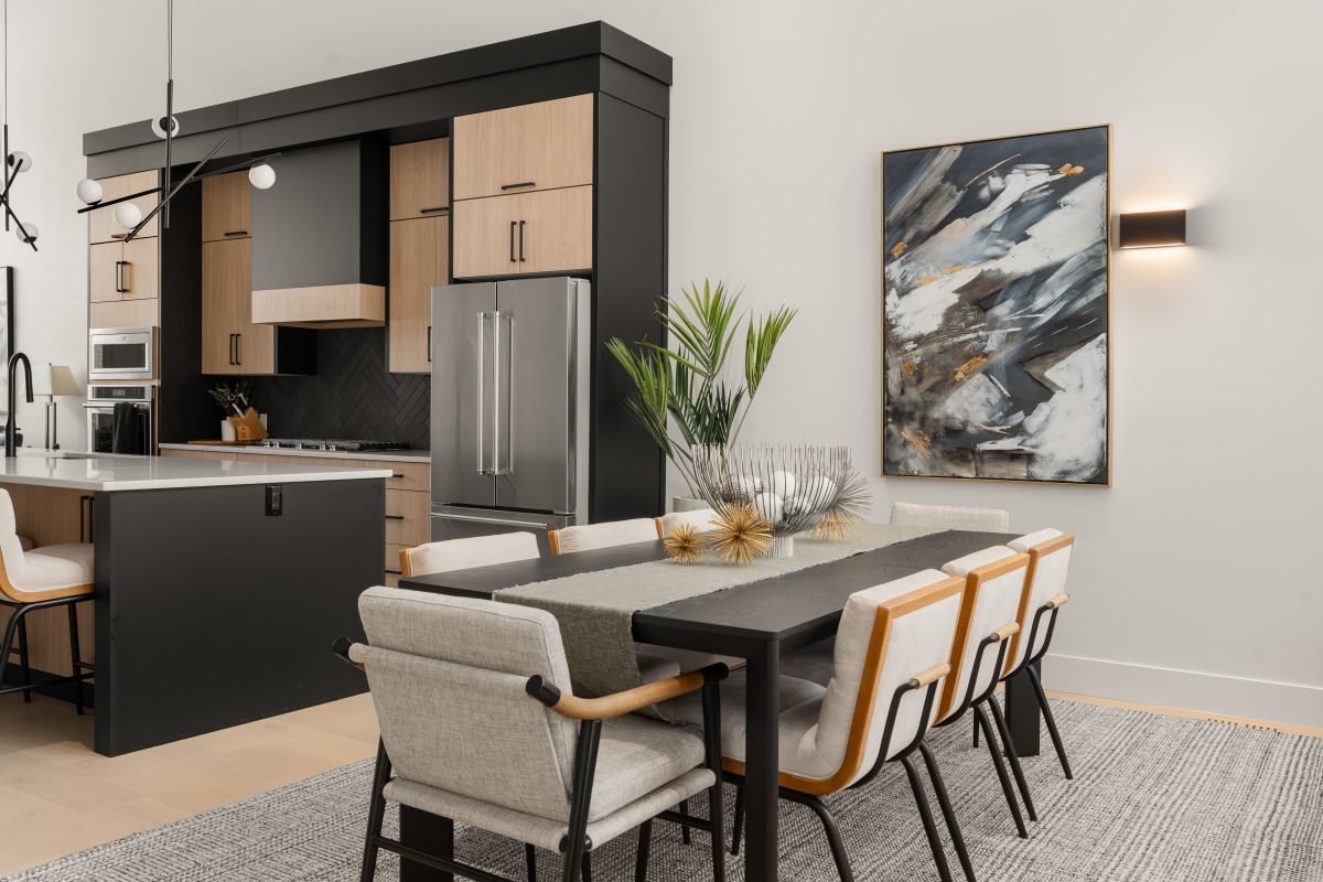
As with most real estate moves, the window treatments we installed in their Killarney home had to stay behind for the new owners. And since this was also a new build (which, frustratingly, never includes window coverings), we re-ordered the Hunter Douglas Silhouette blinds they had fallen in love with.
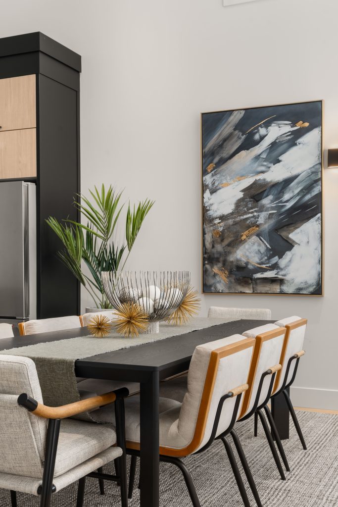
On install day, we paid close attention to ceiling height and how it would impact the scale of everything in the room. We brought forward the large artwork from their previous dining space and rehung it at the end of the table—still the right piece, just given a bit more presence here. With the table now living fully extended, we updated the tablescape with a linen runner to soften the expanse of black and introduced larger-scale decor to better suit the proportions of the room.
Taller greenery rounds out the space, giving it that last layer that makes everything feel new.
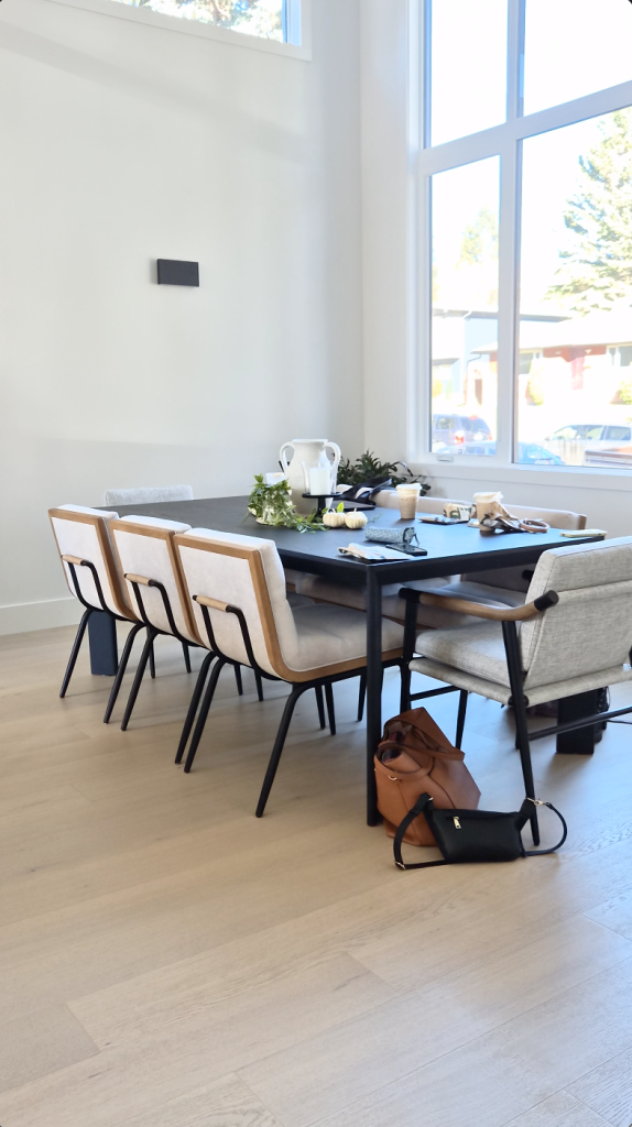
Dining Room Before
Living Room
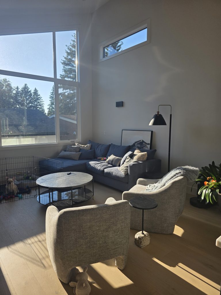
This room is where the shift to a larger footprint really came into play.
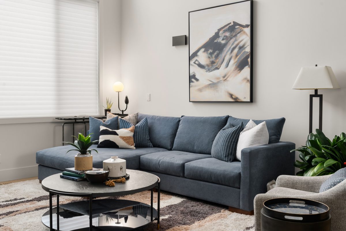
Rather than starting over, we reworked what they already had—pulling in pieces from their previous living and sitting rooms and giving them a new layout to suit the scale of this space. The only new addition here is the raw-edge stone console table with wrought iron legs, tucked under the window at the end of the sofa. It serves as a convenient side table without getting lost behind the sofa and gives their new bird lamp the perfect place to land.
A few key moves:
-
Two lounge chairs came in from the sitting room to help anchor the living room seating area
-
The larger side table stayed between the chairs
-
The smaller stone table (previously with the chairs) was moved into the bathroom
-
The swivel chair was relocated to the bedroom, where it made more sense as a single chair in a smaller room
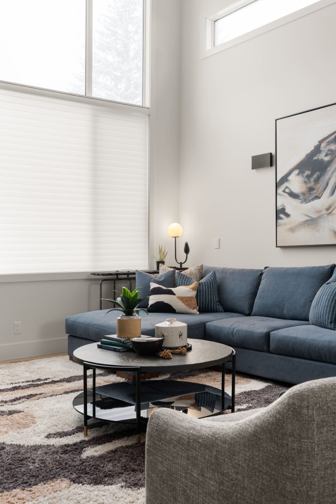
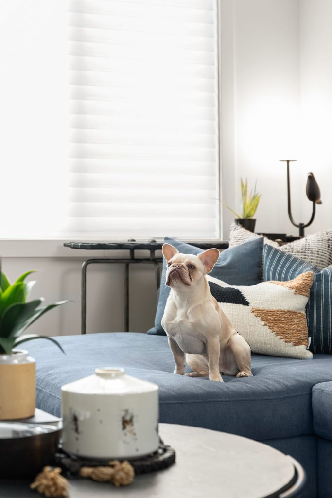
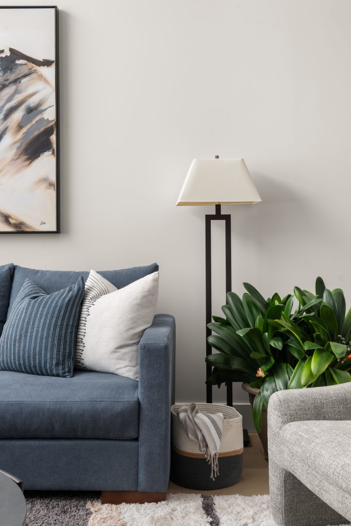
We updated the styling with new pillows on the sofa (chosen to be a little more forgiving than their previous pillows for their new little land shark) and kept the rest layered and familiar.
And, as expected, the Hunter Douglas Silhouette blinds made a return. Same soft light, just in a new setting.
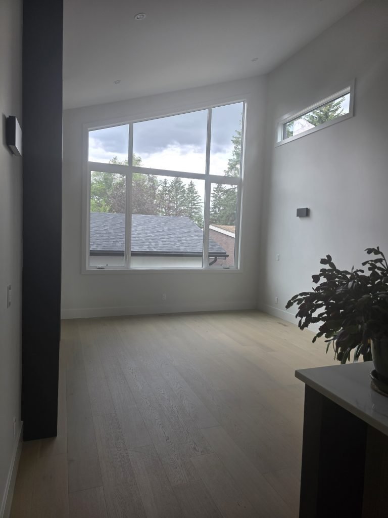
Living Room Before
Primary Suite: Bedroom & Ensuite
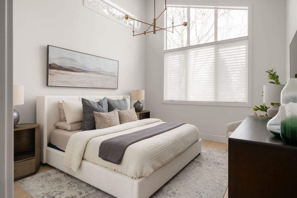
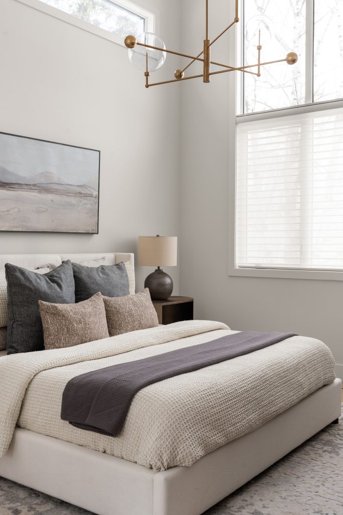
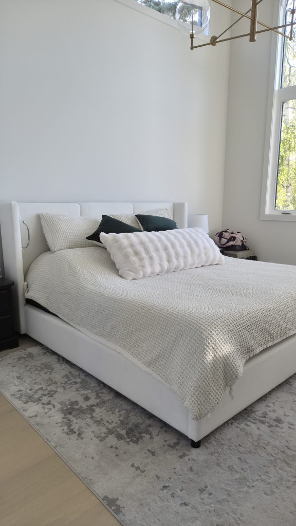
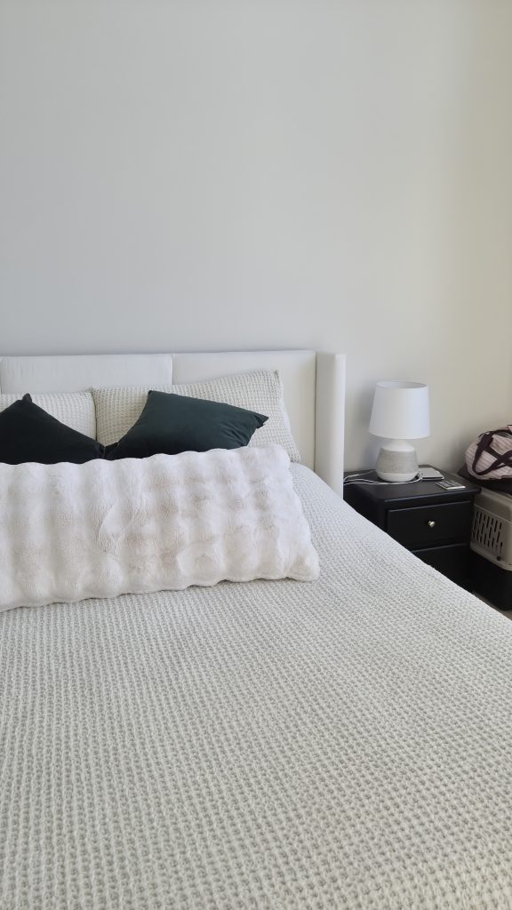
The bed set the tone for this room from the start. It was a piece the clients had purchased from a moodboard we created after their last project, and it carried over beautifully—soft, grounded, and exactly the kind of focal point this space needed.
Everything else, however, was new.
Primary Bedroom Furnishings & Styling
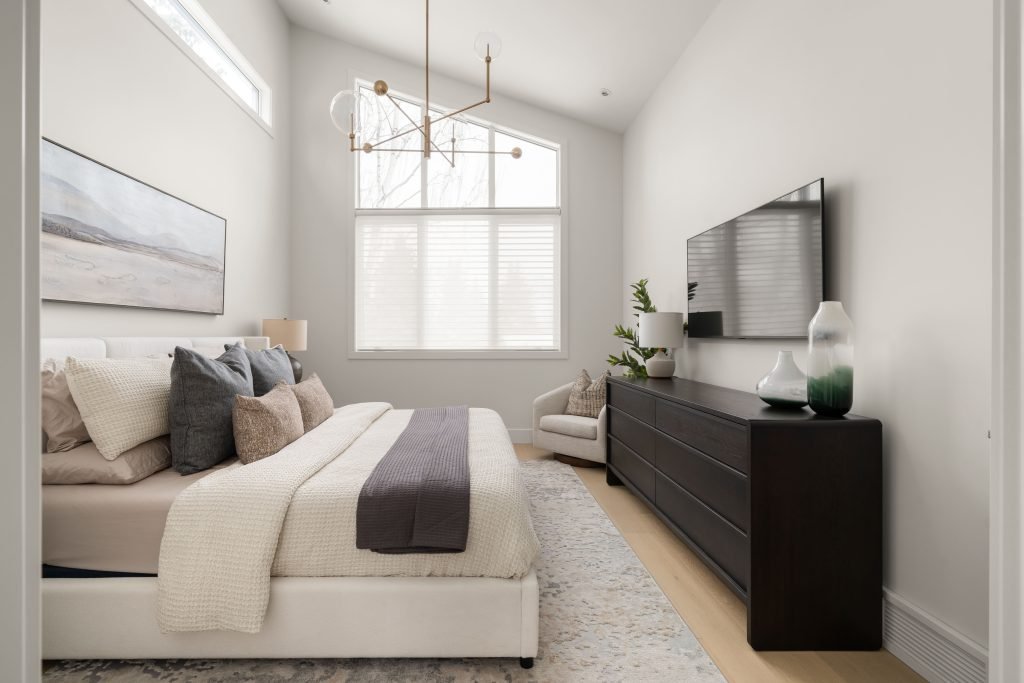
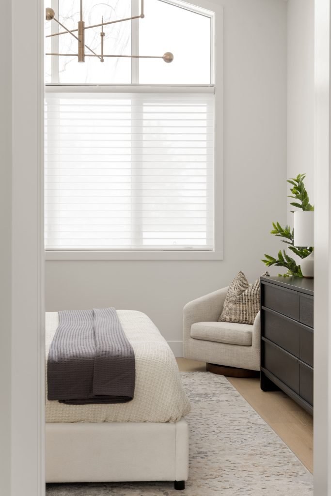
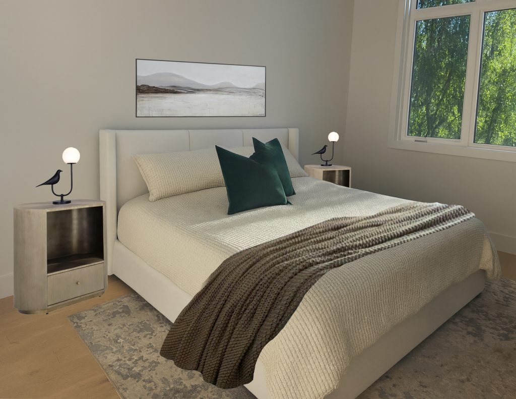
We brought in a pair of bronze oval nightstands (still obsessed) and topped them with hammered bronze lamps. The mix of warm metals plays nicely with the existing brass fixture overhead—coordinated, but not overly matched. A new black solid wood dresser anchors the shorter wall beneath the ceiling slope, giving that side of the room the weight it needed.
A few familiar pieces found their way back in. The swivel chair from the previous living room now lives in the corner here, and the area rug from the sitting room made the move as well—both settling in like they were always meant for this space.
We finished it off additional layered lighting, a faux tree, and two glass sculptural vases which reminded us of the fresh mountain air our clients crave. With new pillows and throws, we designed a bedroom our clients couldn’t wait to sink into and curl up with their puppy, Chloe.
Angled Windows: Blinds
As for the windows, the Hunter Douglas Silhouette blinds made another appearance. The angled architecture in this room is beautiful, but it comes with limitations. While there are specialty options for angled windows, overall window width is an obstacle and often require splitting the blinds or switching to a completely different system. In this case, consistency won. These blinds provide privacy and keep the look cohesive throughout the home, which mattered more than full blackout—especially with one early riser and one committed sleep-mask user.
Primary Bedroom & Ensuite Artwork
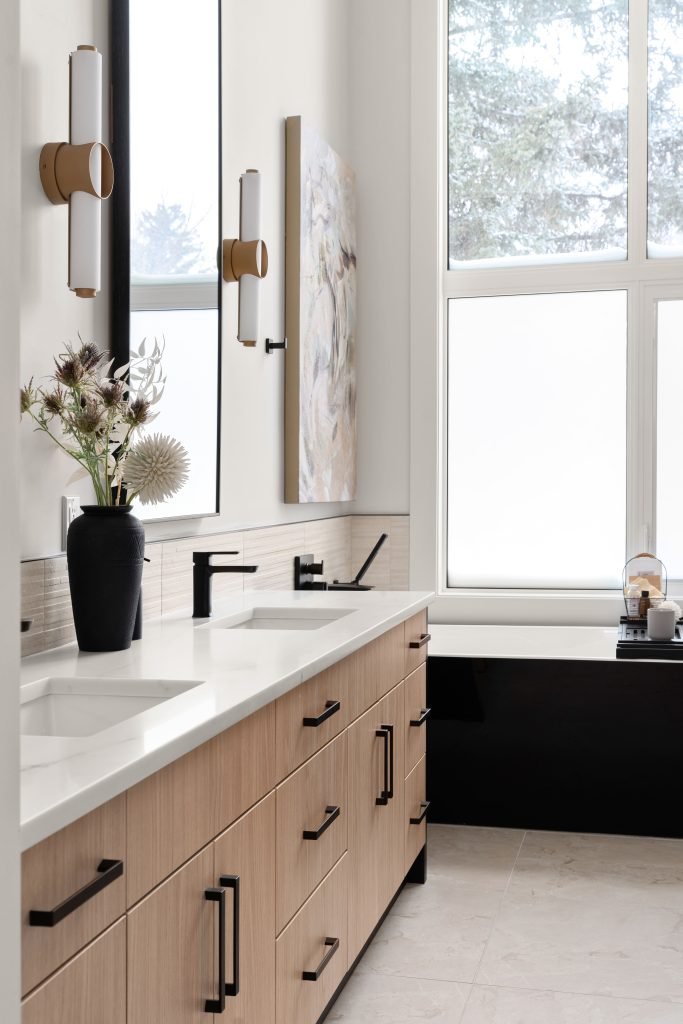
Artwork played a key role across both the bedroom and ensuite, helping us work with the scale and architecture rather than compete with it.
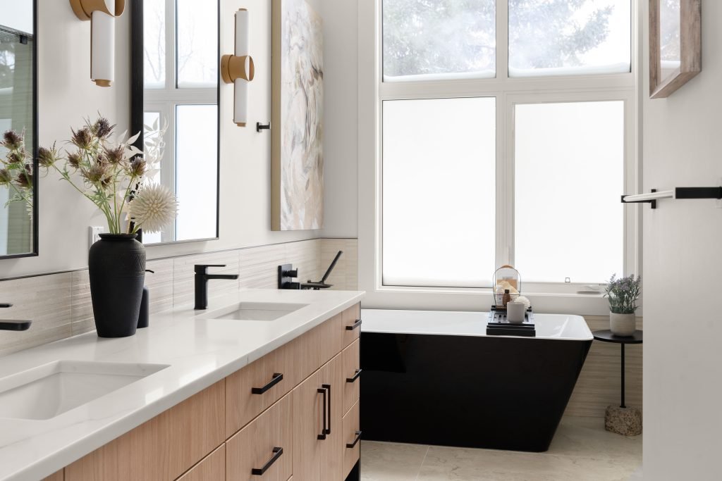
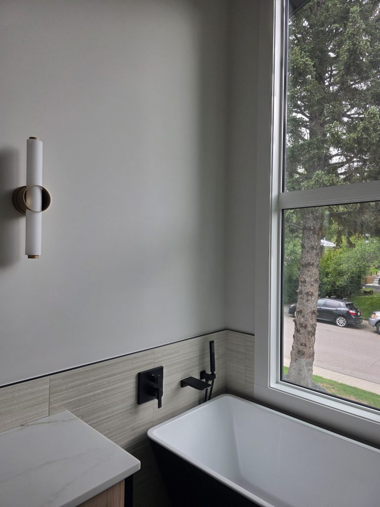
In the bedroom, the abstract landscape above the bed visually lifts the headboard and brings the eye upward without overwhelming the wall. In the ensuite, we carried that same approach forward—introducing a large neutral piece above the tub to extend the vertical sightline and avoid that visual drop from vanity height down to the darker tub. Additional artwork throughout the bathroom softens the space and breaks up the typical new-build feel. Together, these moments create a sense of structure and balance across both rooms, using art not just as decoration, but as a way to shape how the space is experienced.
Primary Ensuite Styling
In the ensuite, we layered in styling that ties everything together—faux florals in a palette that pulls from both the existing finishes (black and wood) and the softer neutrals introduced in the bedroom.
And tucked between the tub and shower: a familiar face. The raw stone side table from the sitting room found its perfect spot here.
Some might call it a side table.
Our clients call it a wine holder.
Primary Bedroom Design Mockup
Primary Bedroom & Ensuite Before
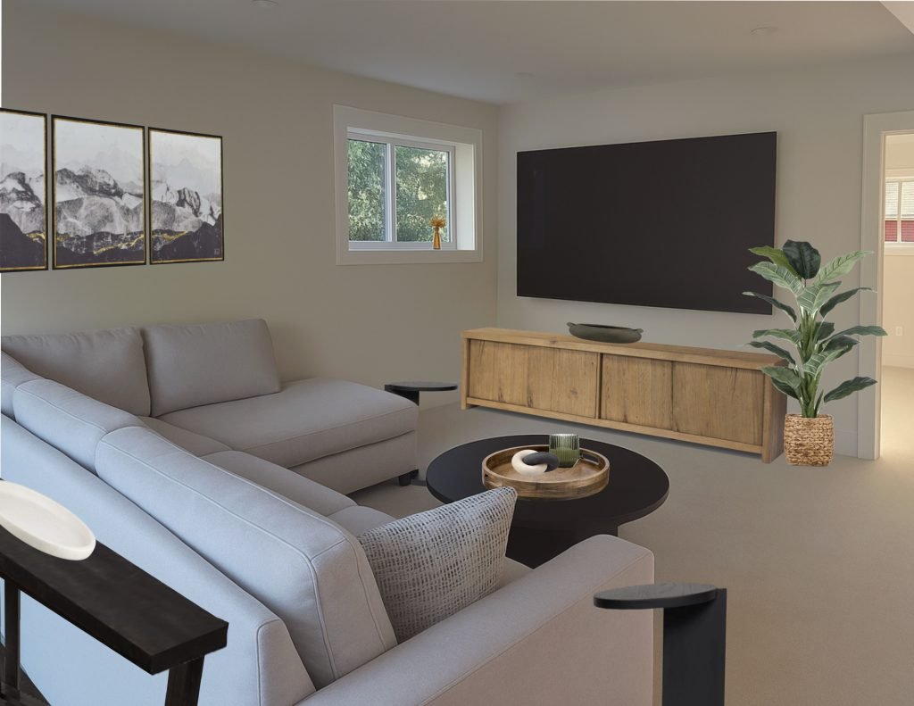
Media Room
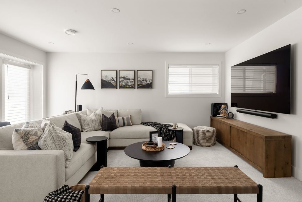
This might be our favourite room in the house—and the one that captures the Modern Mountain direction most clearly.
Black, white, warm wood, and leather.
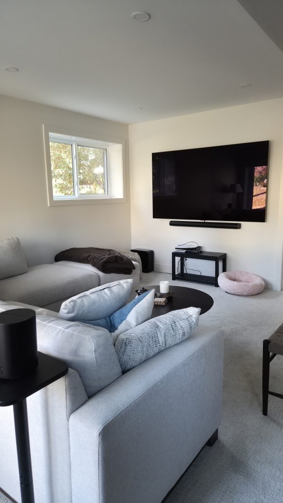
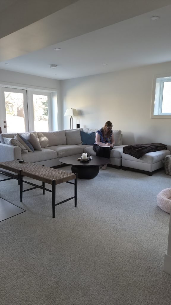
The sectional was existing from their previous basement, and it fit this space perfectly. To balance it, we brought in a new media unit that spans the full wall—scaled to match the sofa and strong enough to anchor the oversized TV.
From there, it became a game of reworking and repositioning.
-
The coffee table moved down from the previous sitting room
-
The floor lamp came from the living room
-
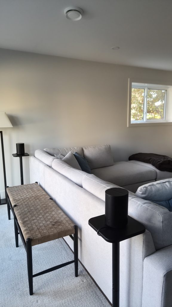
The leather bench was pulled from the dining room
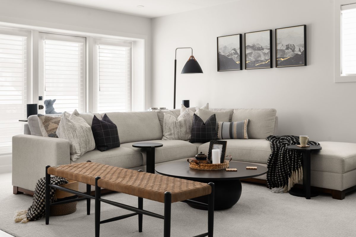
The bench, in particular, found a better role here. With no room for additional seating, it acts as a flexible perch when needed, but more importantly helps define the seating area and create separation from the bar behind. The client also requested C-tables for the sofa, so we sourced two low-profile black ones that tuck in seamlessly without adding bulk.
Behind the sofa, we introduced a long black console table—one of those moves that quietly changes how the room functions. Since this is a walk-out with French doors to the front driveway (hello summer driveway parties!!), the back of the couch would have otherwise been the first thing you see when entering. The console gives that entry moment a bit more ‘welcome’, and a place to make an impression.
It also gave us the perfect spot for one of our favourite finds—a French bulldog statue mid-yoga. Equal parts ridiculous and perfect.
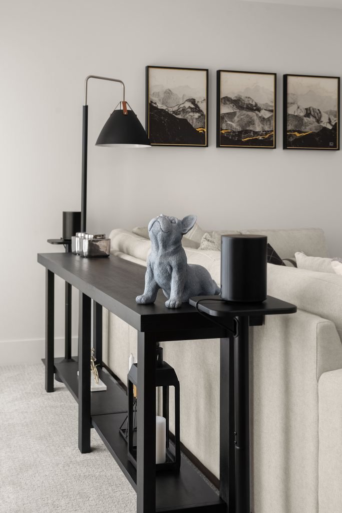
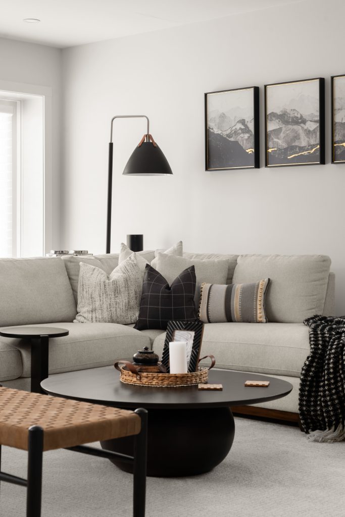
Artwork played a big role here as well. The mountain series above the sofa was something we had originally tried to incorporate into their last home, so it felt especially satisfying to finally see it land. From there, we leaned into a more monochromatic palette—black, white, and soft greys—to let the materials do the talking.
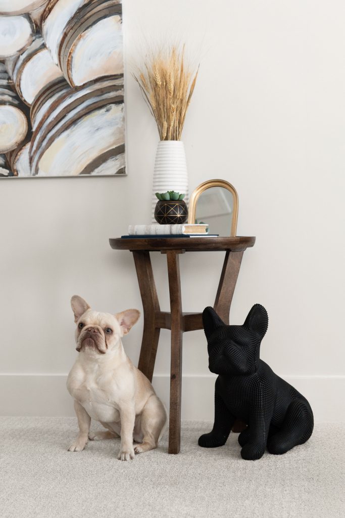
And then there’s the “almost” wall. The one that feels like it should hold a console table but never quite has the clearance because of the stairs. Instead, we brought in a large piece of barrel art to hold the space, paired with a small side table for styling.
The table worked.
But it felt a little… alone.
Enter: another French bulldog. This one not doing yoga, but equally committed to the design.
Chloe approves.
Media Room Design Mockup
Media Room Before
Design Details
Throughout the spaces, we layered in a mix of artwork, greenery, and sculptural decor that builds on the modern mountain palette—soft neutrals, warm woods, and moments of black to ground it all. These pieces weren’t about filling space, but about reinforcing it. Repeating materials. Echoing tones. Giving each vignette a sense of intention without feeling overly styled.
You’ll notice a consistent thread in the artwork—abstract, tonal, and often landscape-inspired. It shows up in different scales and moments throughout the home, creating a quiet rhythm from room to room. Paired with simple styling and natural elements, it keeps the overall feeling cohesive while still letting each space stand on its own.
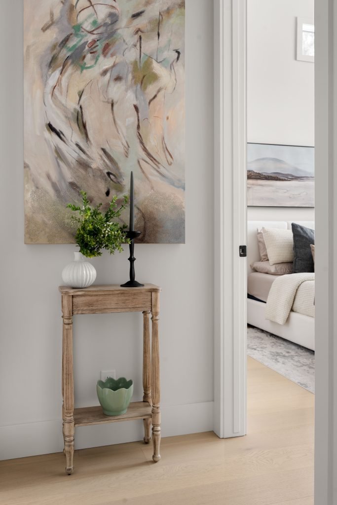
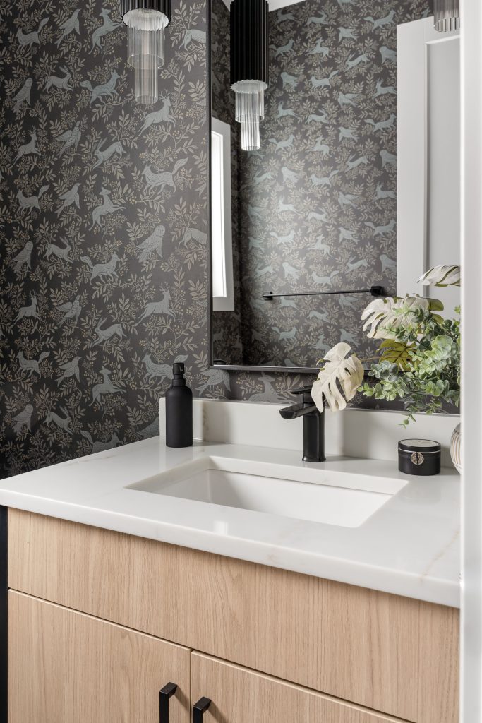
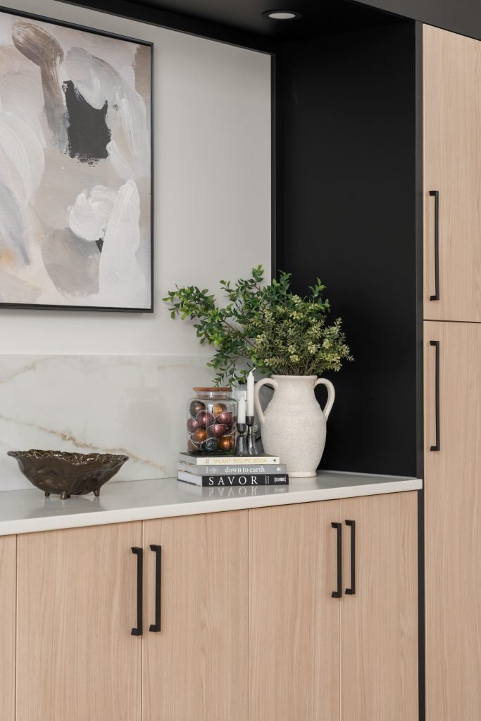
It’s these smaller decisions—the layering of objects, the balance of materials, the restraint in what not to add—that give the home its finished feel. Nothing loud. Nothing forced. Just a series of styling decisions that, together, make the whole house feel complete.
This is the second time we’ve worked with Unshelf Design, and once again, Sarah and her team delivered a result that is nothing short of exceptional. After she helped us style our previous home in Killarney, we knew there was no one else we’d trust to help us transition into our new, larger home in NW Calgary.
What makes Sarah so unique is her ability to evolve a design. We wanted to bring the same feel we loved from our first house into this new space, but the layout and scale were completely different. Sarah masterfully reworked our existing furniture and sourced new, perfectly scaled items to bring everything together in the perfect way.
Sarah has a brilliant eye! If you are looking for a designer who listens, understands how you live, and creates a cohesive, intentional space, look no further than Unshelf. We couldn’t be happier!